Agency // We Are Royale
Creative Director // Mike Arcangeli
Role // Lead Designer
Rondo
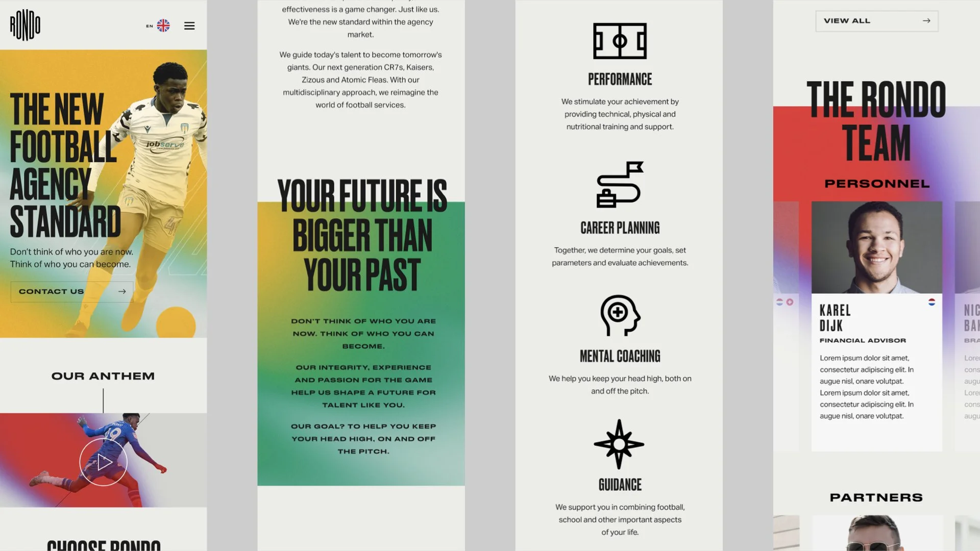
Rondo is a sports management agency that primarily deals with young overseas soccer players. They came to us looking to do a complete rebrand, website, promotional video and presentation template.
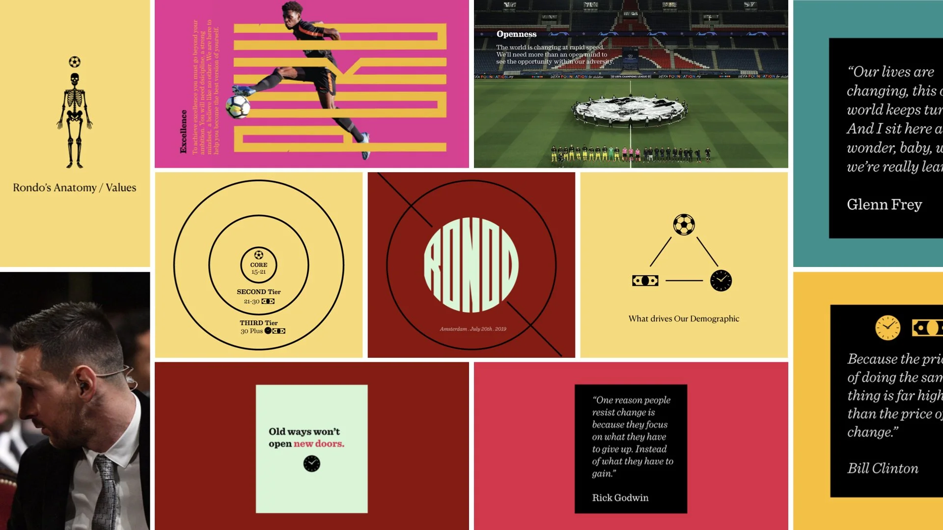
Here’s where they were when they came to us. The logo was indecipherable, colors all over the place. It just didn’t meet the quality and aspirations they were going for.
They want to be bold, premium, aspirational and to build a new standard in sports management.
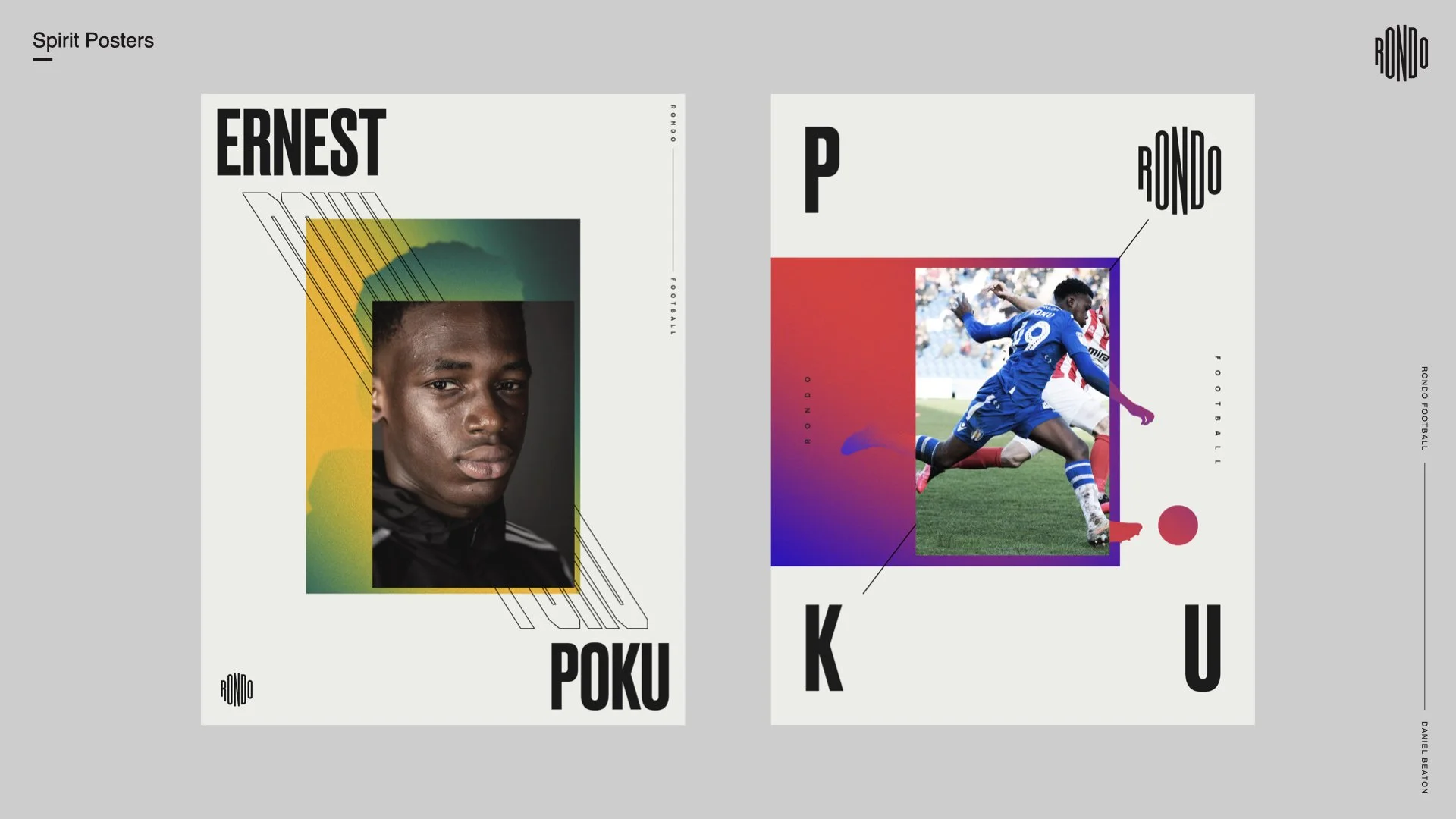
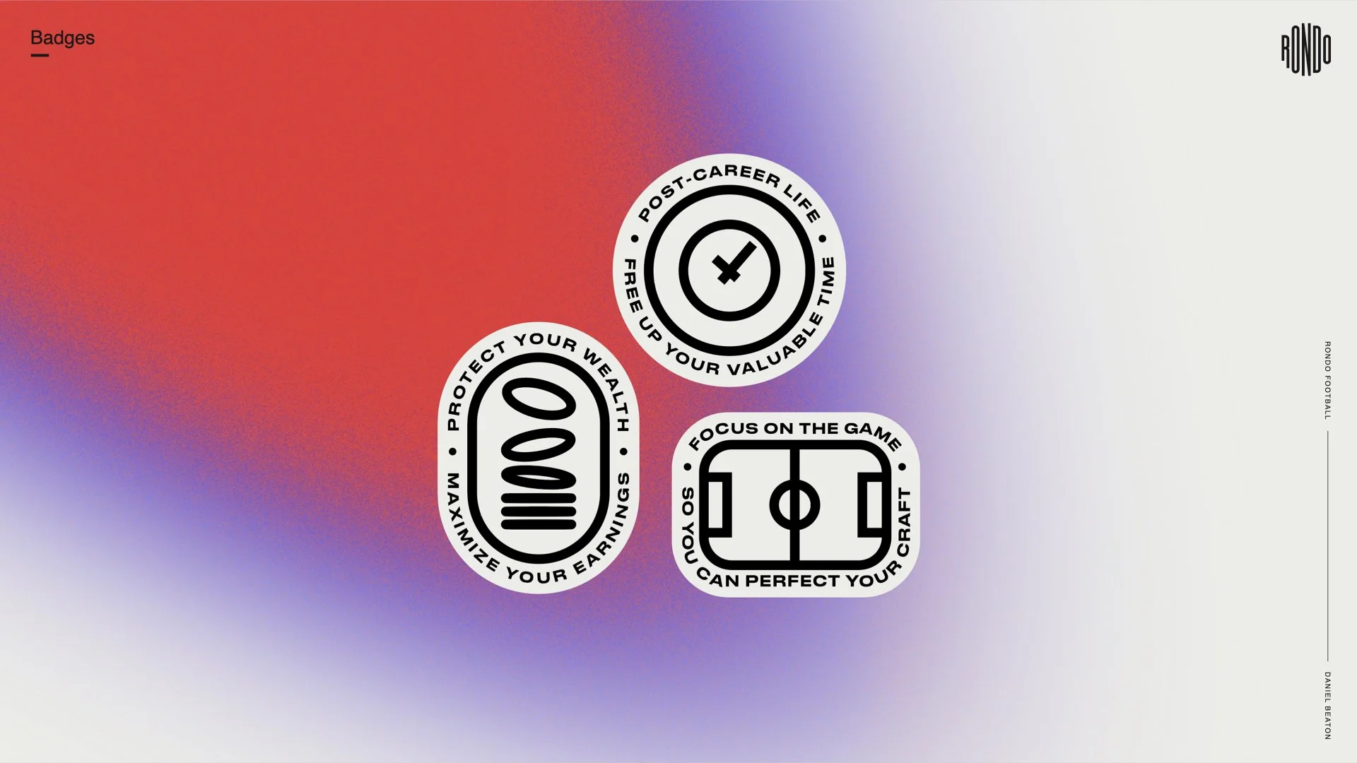
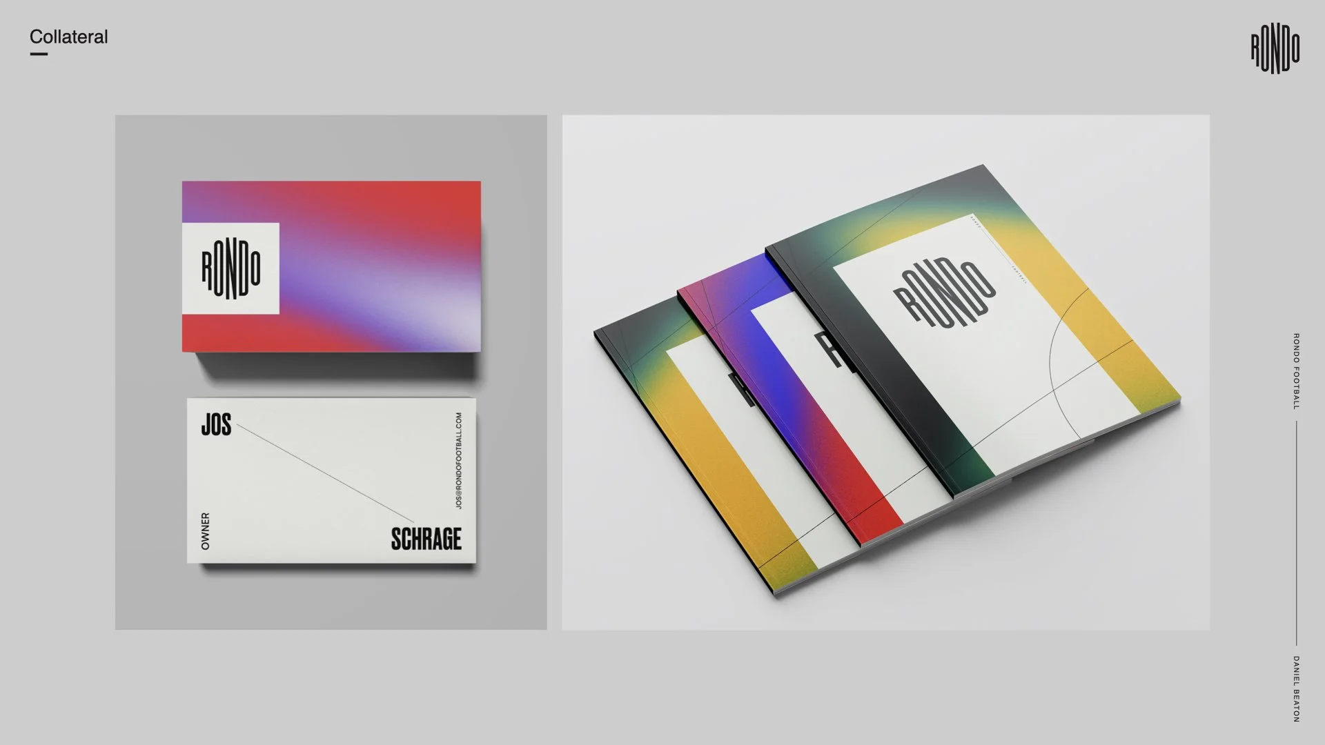
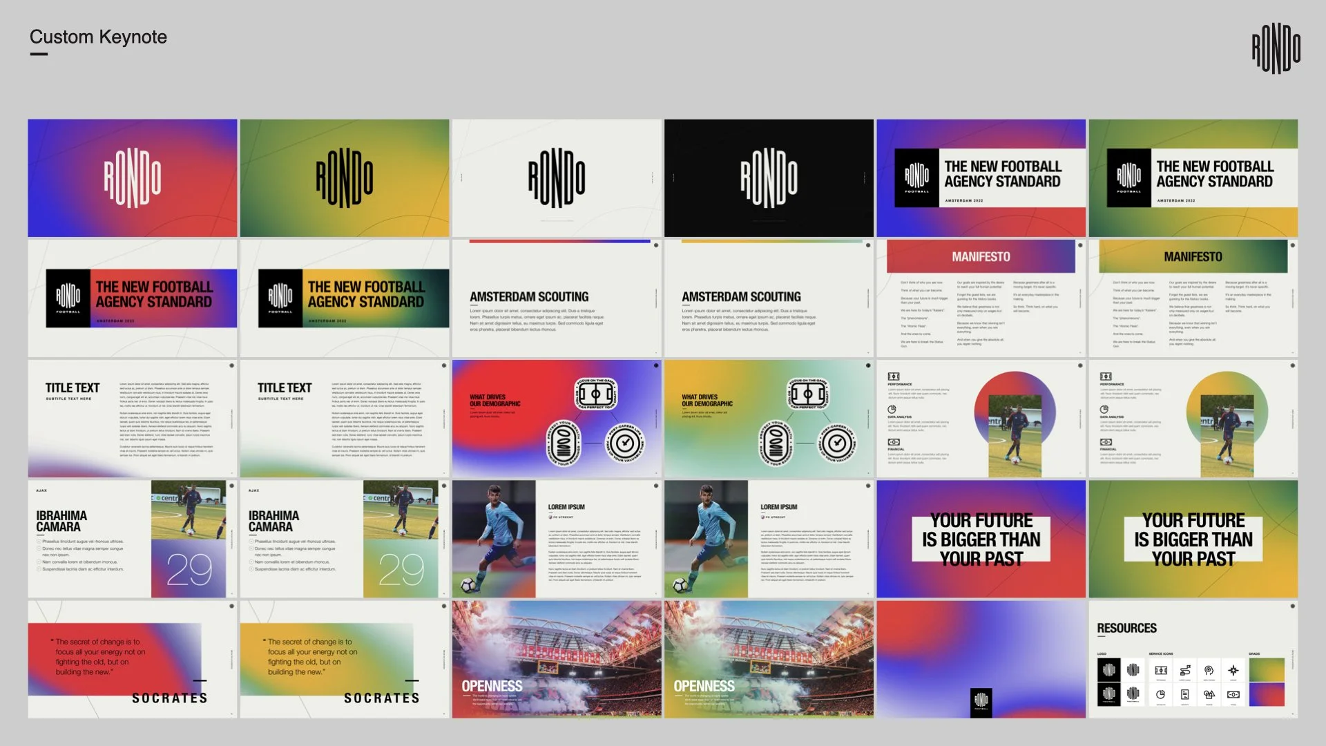
Final
How We
Got There
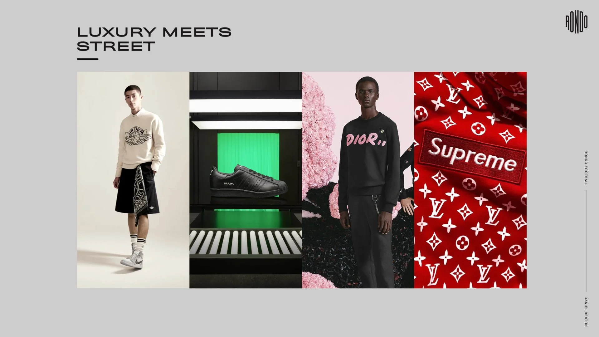
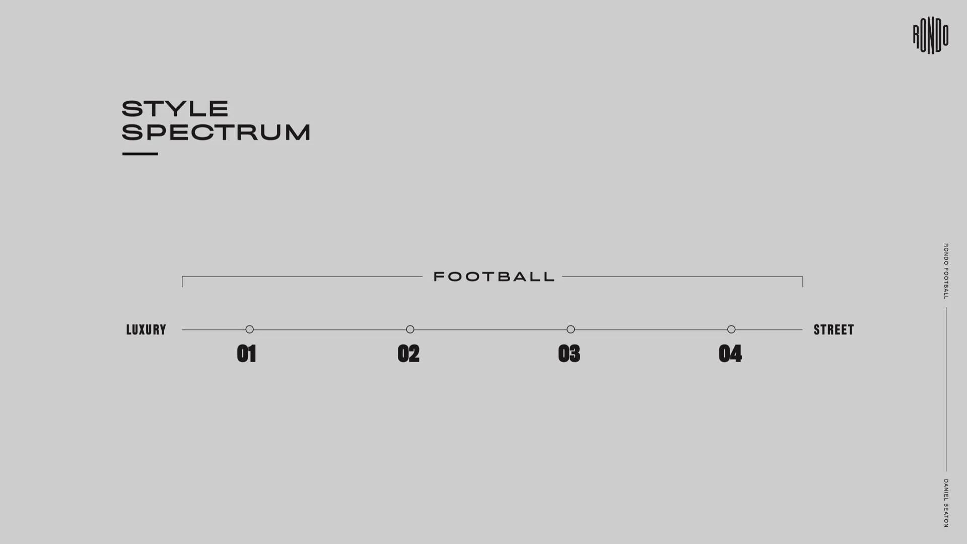
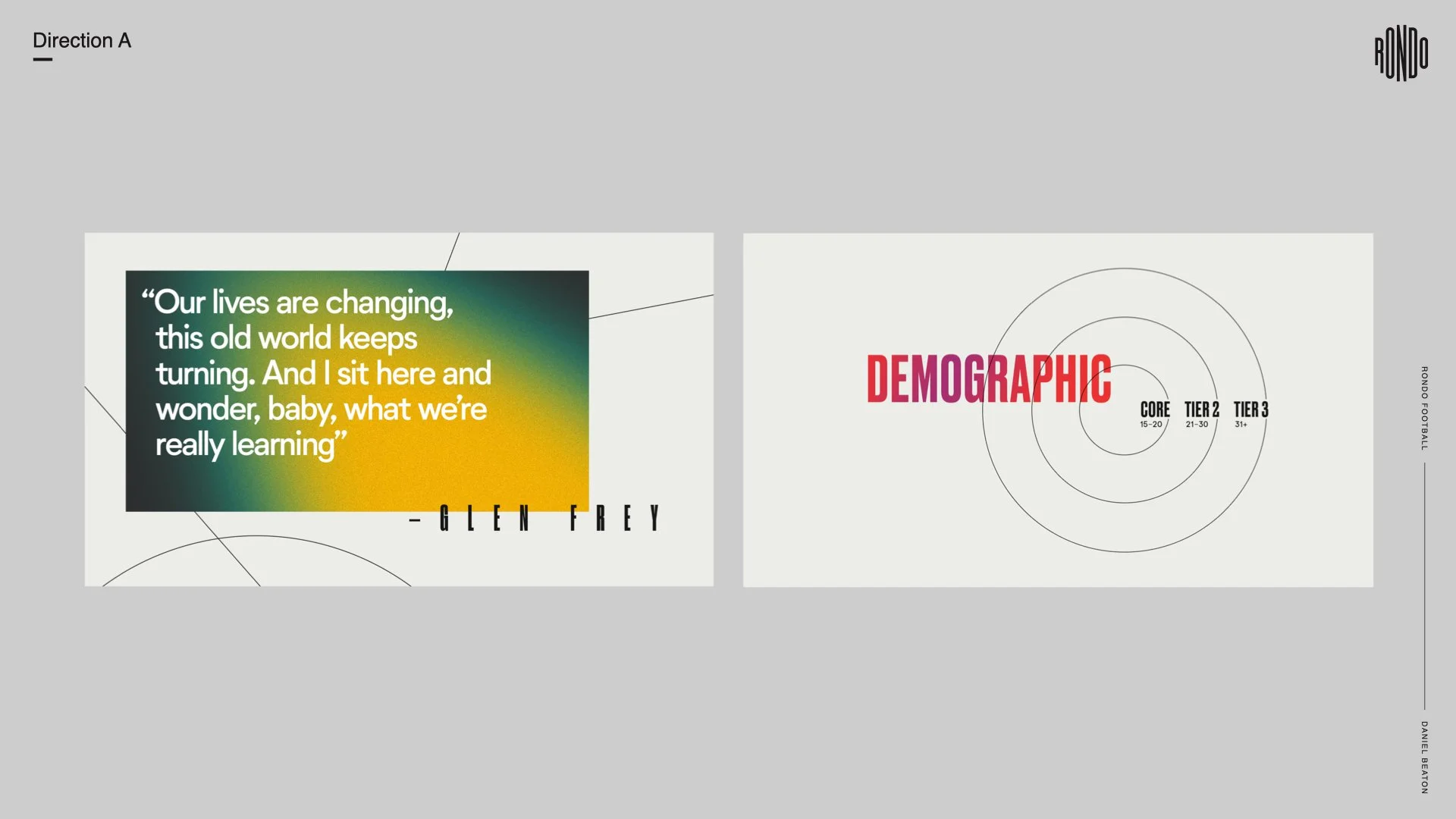
Keeping their young demographics in mind, we established their brand attributes that consisted of bold, premium, and aspirational. For the first presentation we felt that the sweet spot was going to be somewhere between this luxury and street look, premium and young, elegant and bold. We presented a range of directions that fell along this style spectrum.
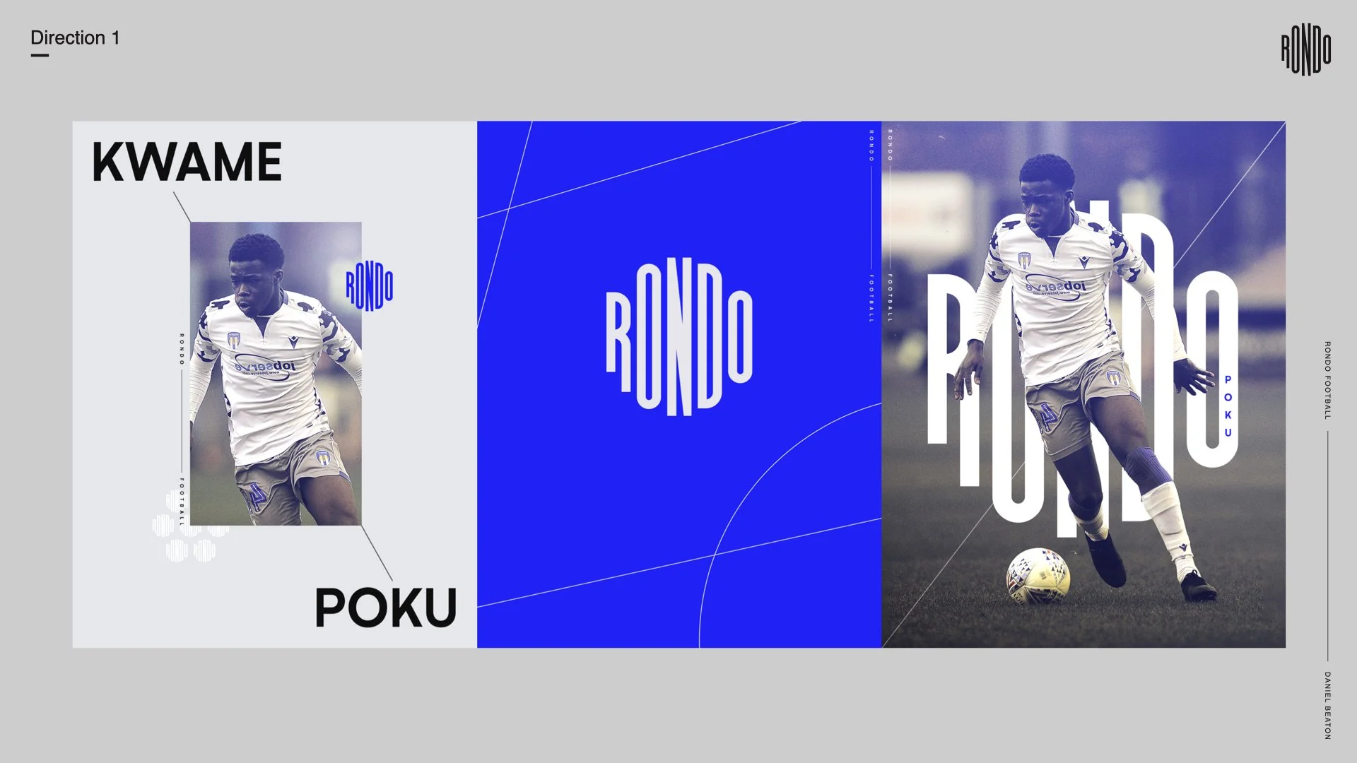
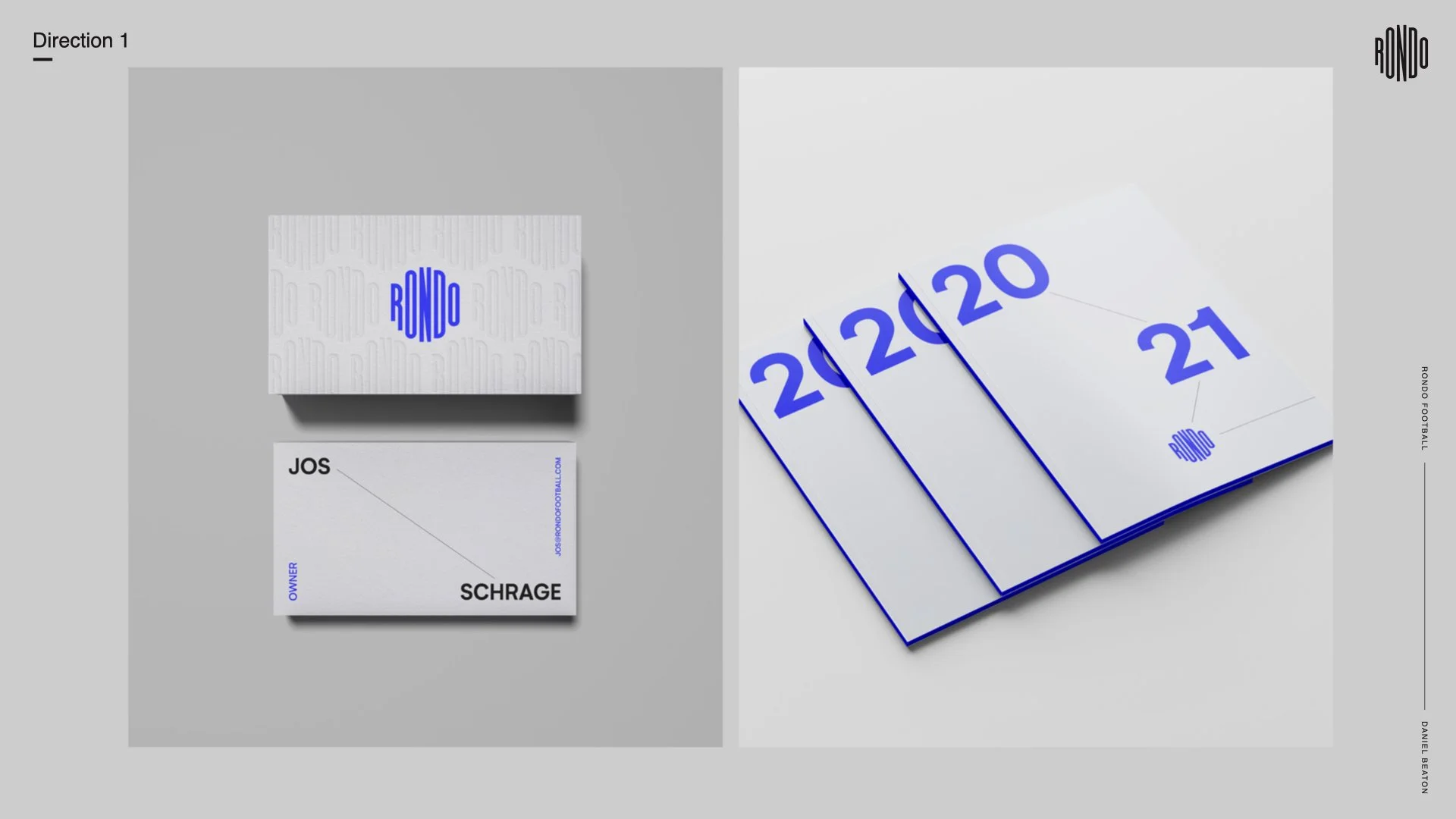
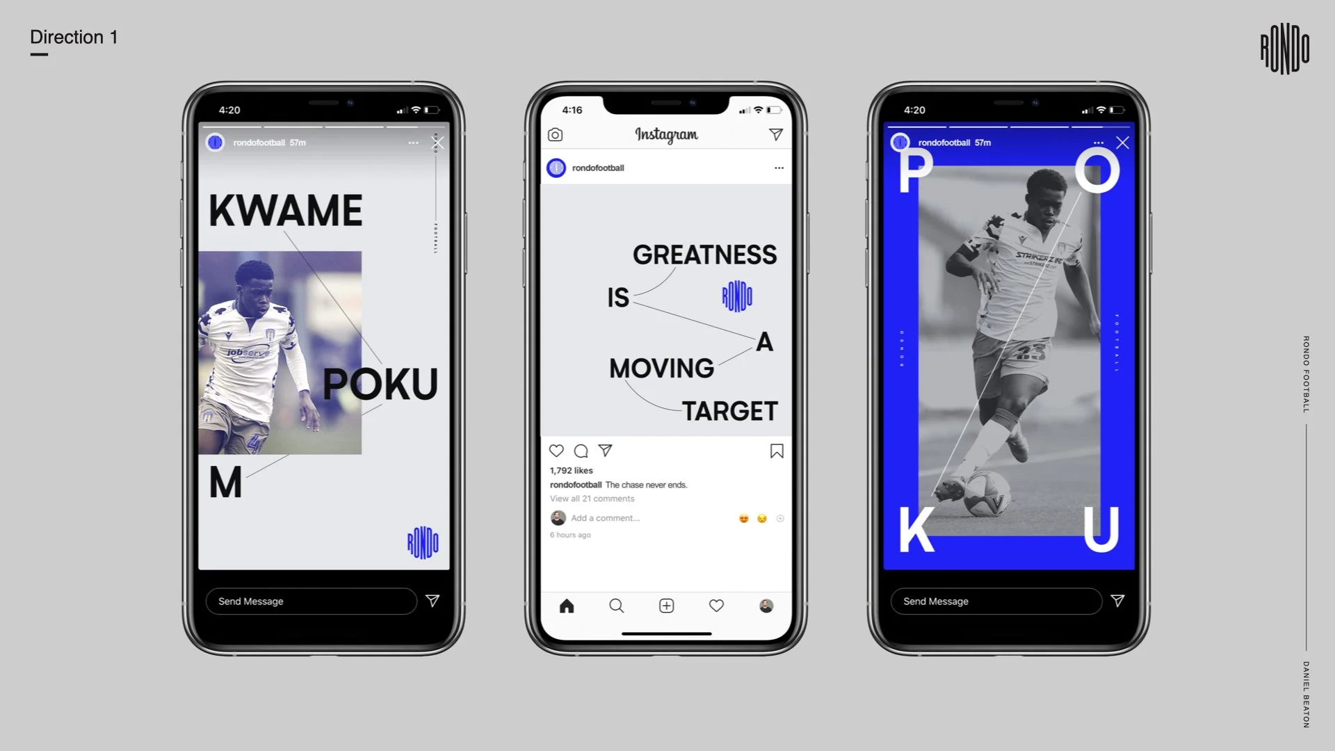
The first direction, the one that felt the most luxurious, was inspired by the Rondo drill itself. The name rondo comes from the rondo drill that is a series of passes between players that optimizes team possession, its a fundamental soccer skill.
Round One
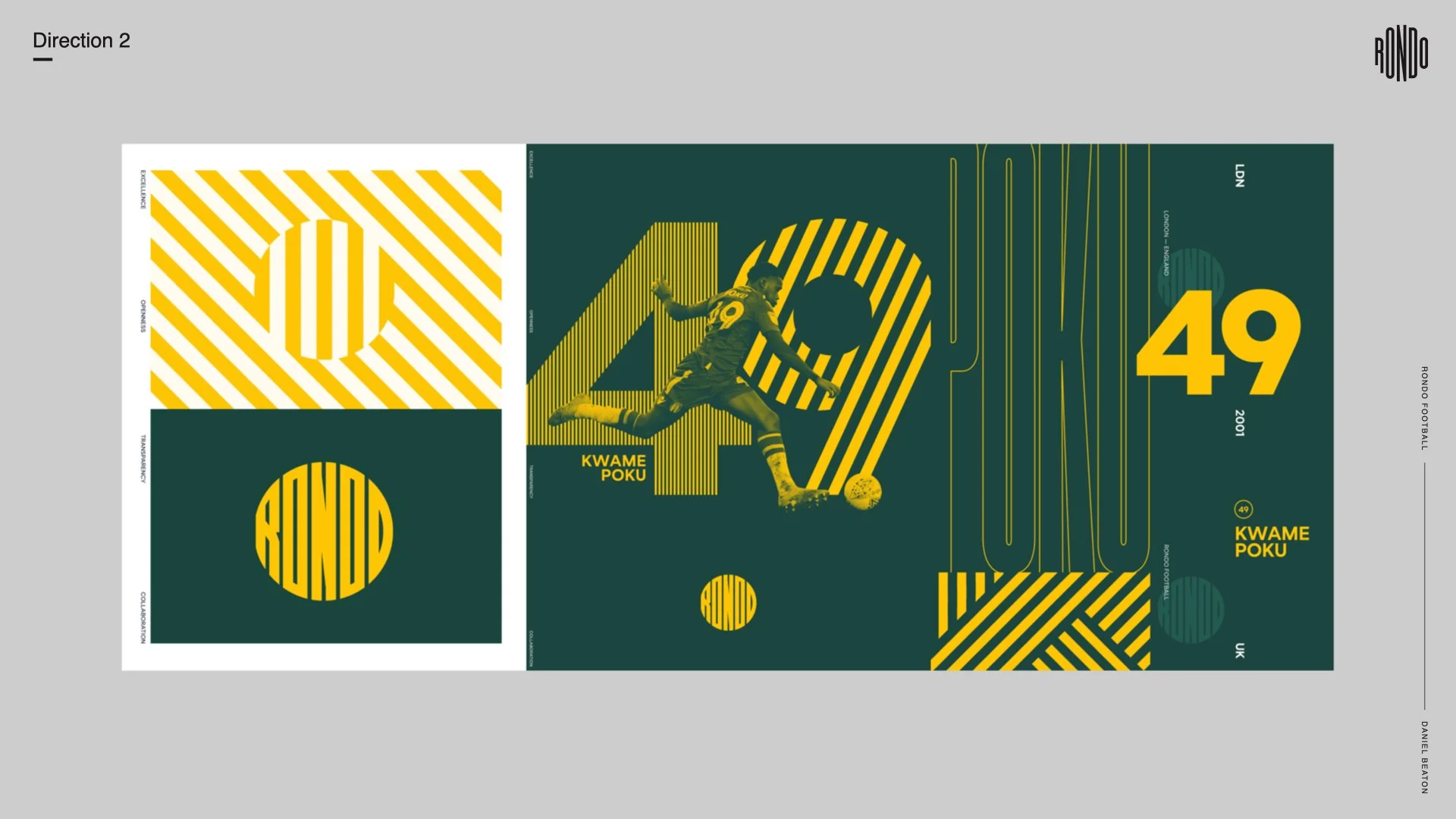
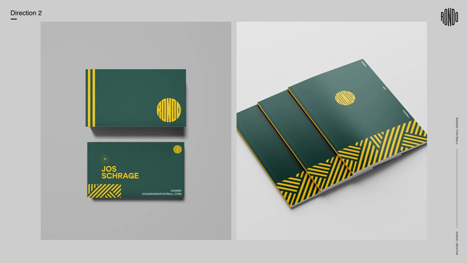
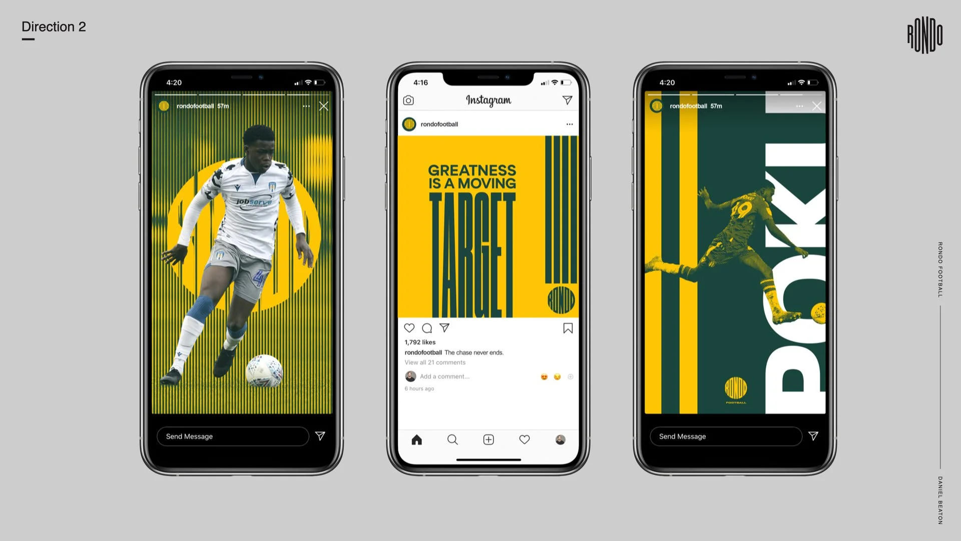
The 2nd direction amps up boldness and impact and is directly inspired by the logo itself with its series of bold parallel lines, accented with condensed type while also taking cues from a more classic athletic aesthetic yet still feeling modern.
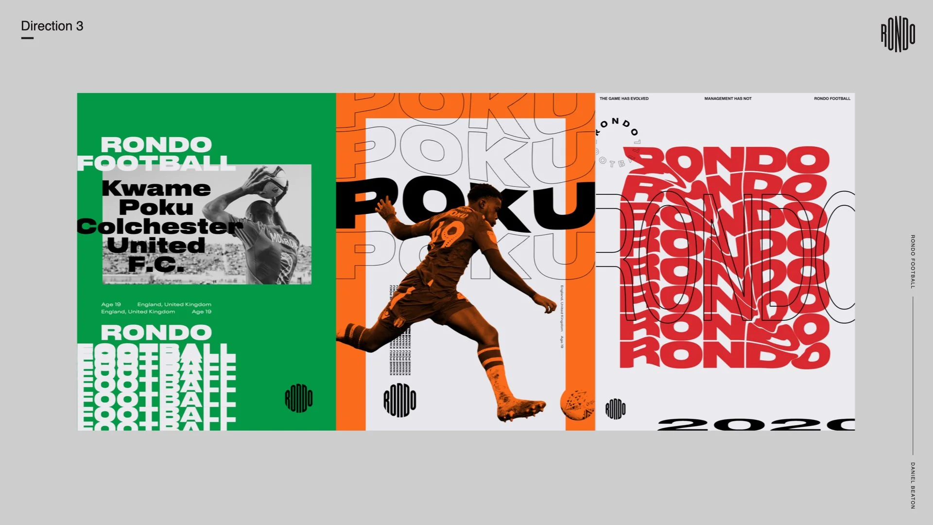
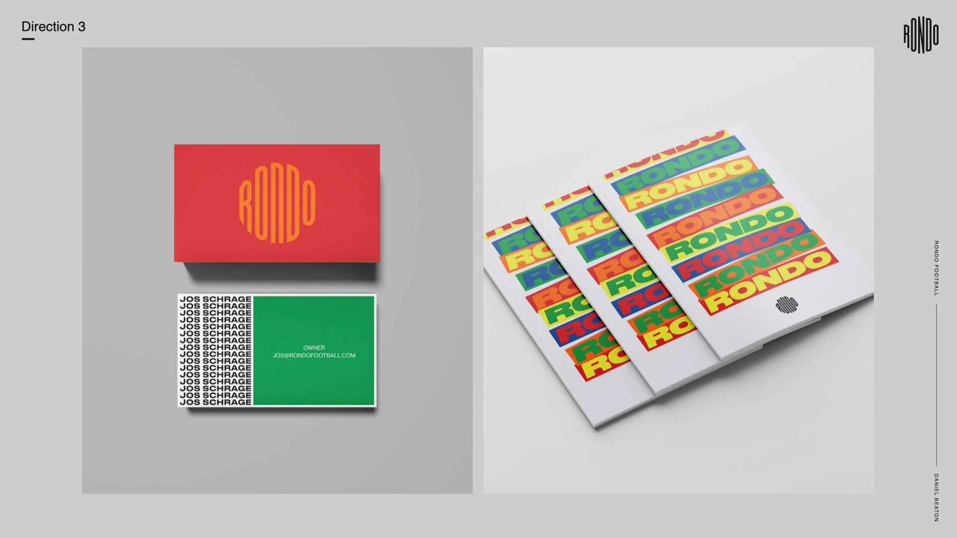
The last direction really pushes the street-cool end of the spectrum. Many of the backgrounds of the world’s best players, they grew up playing under street lights, not giant stadiums. This direction has that DIY sort of ethos, its un-structured, layered, plays with repetition. It’s geared toward their tier 1 target audience.
Round Two
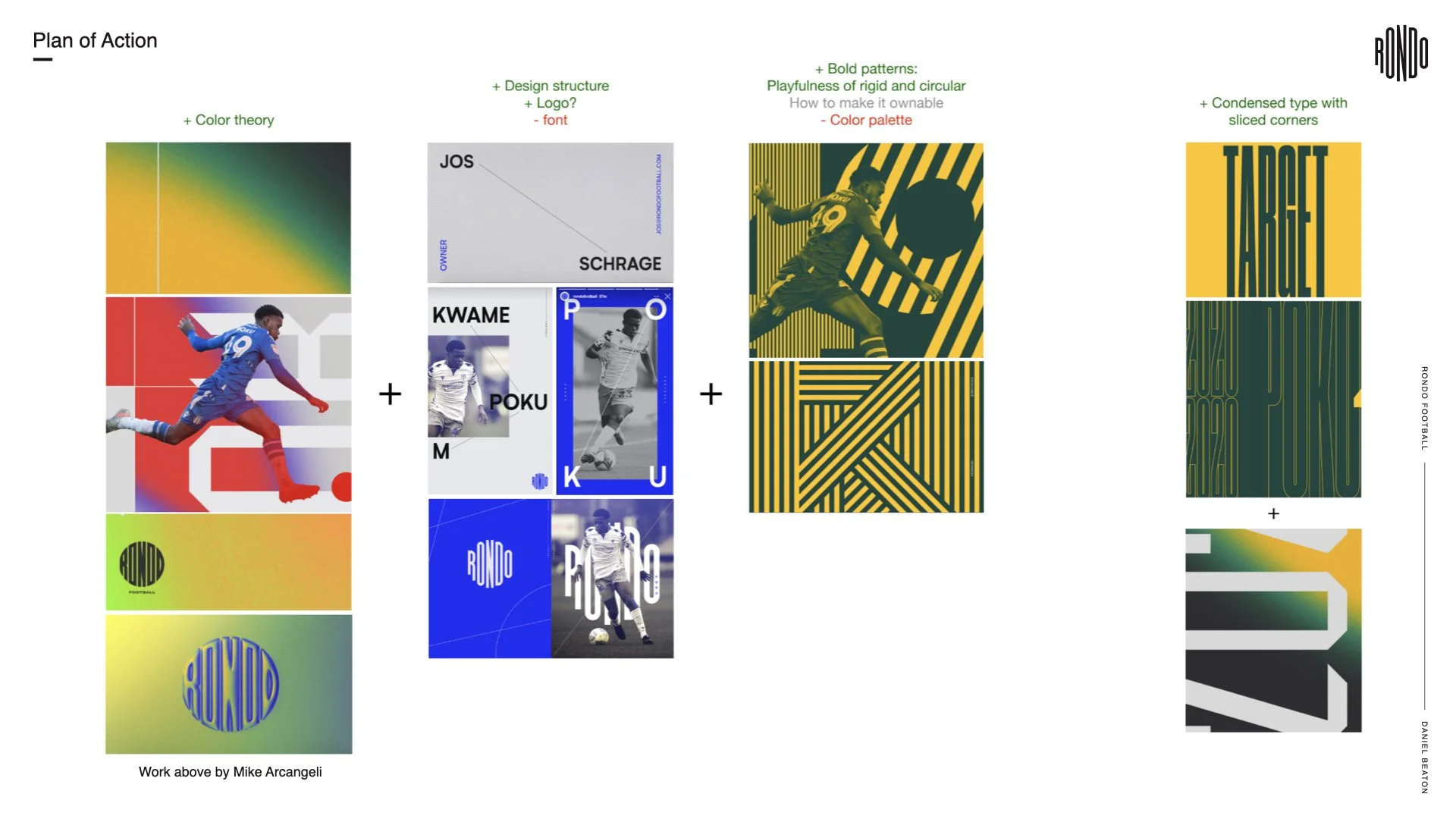
Here we really started to dial in on creative executions. Here’s the “visual cheat sheet” condensing client feedback and how to approach the next round.
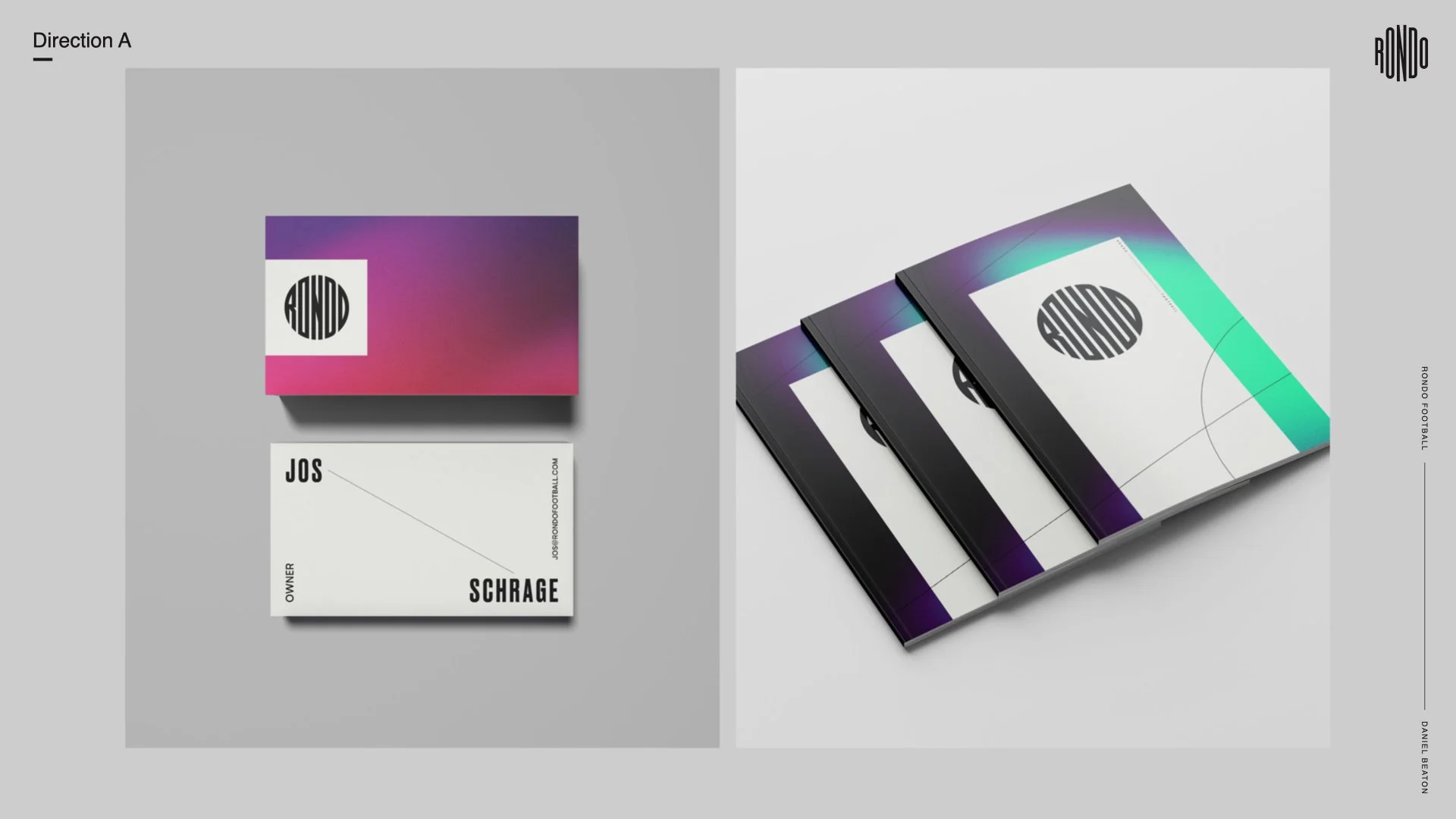
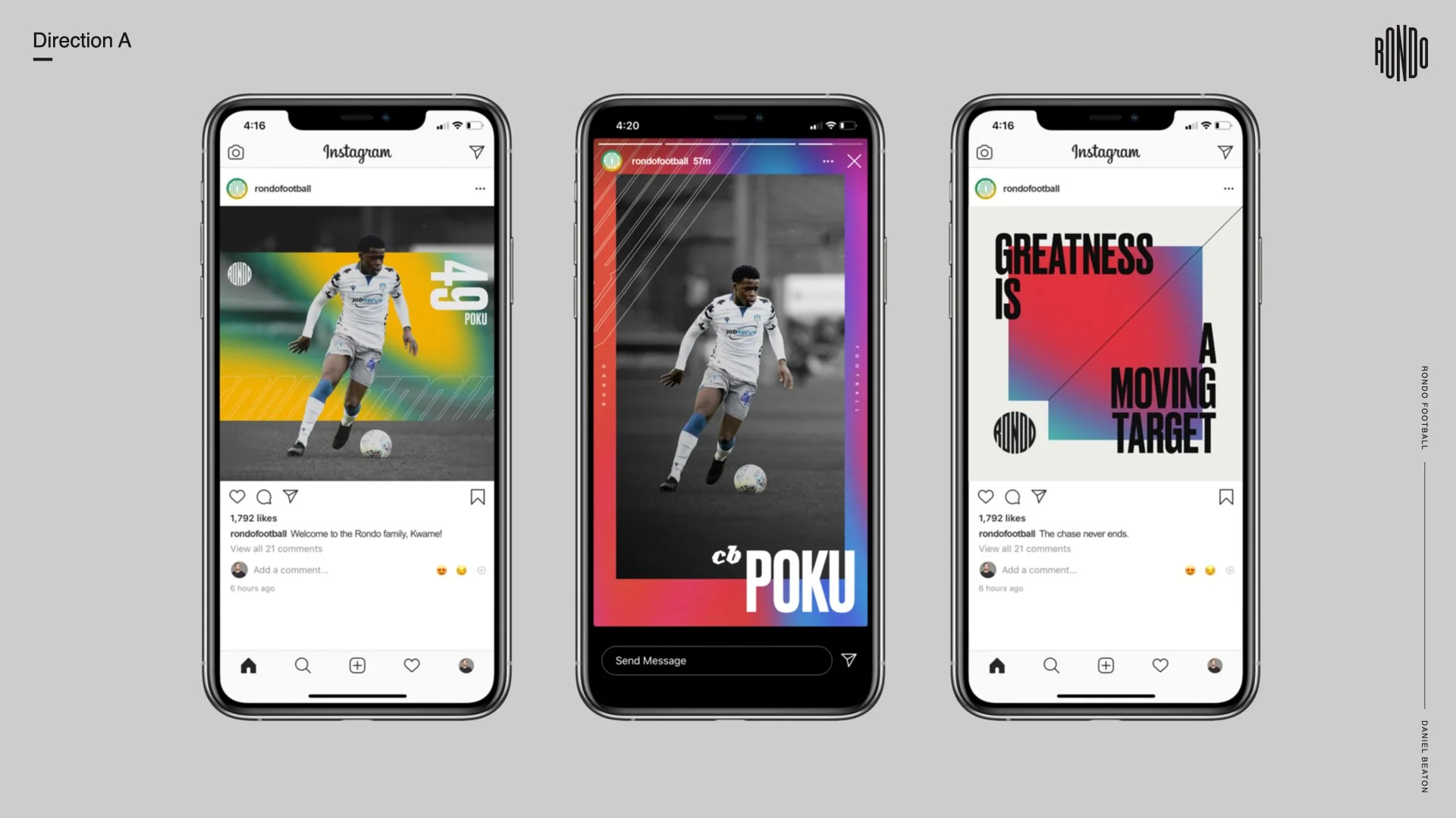
For direction A we took the framework from the luxury direction of the first round, infused it with organic, colorful grad textures that feel aspirational.
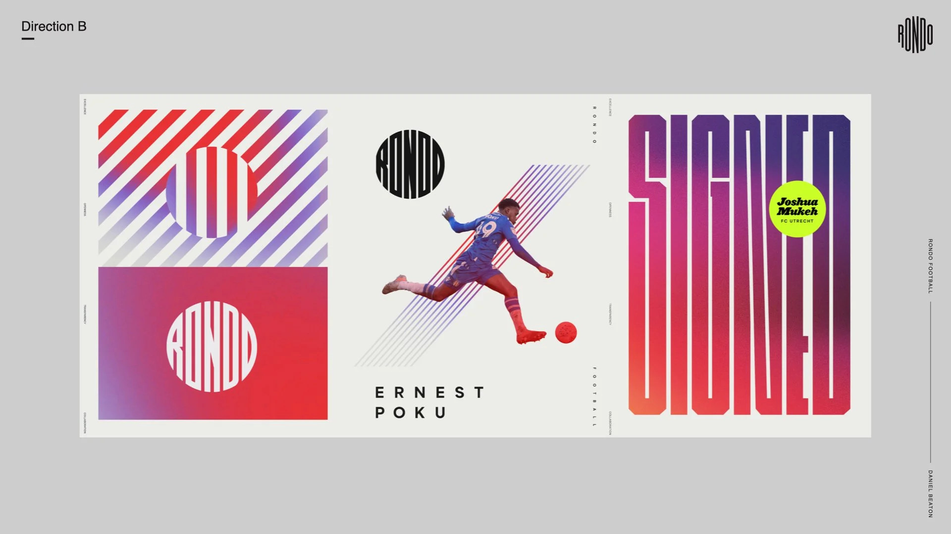
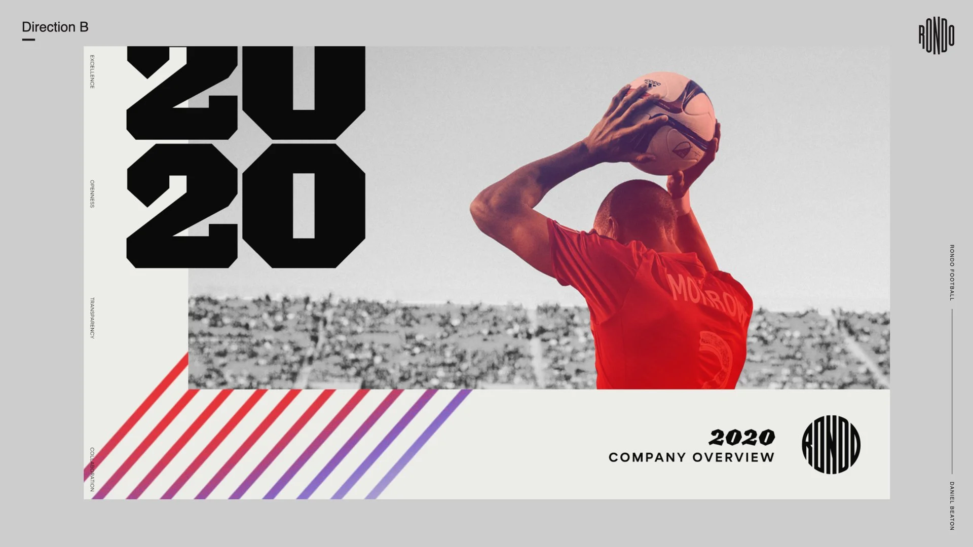
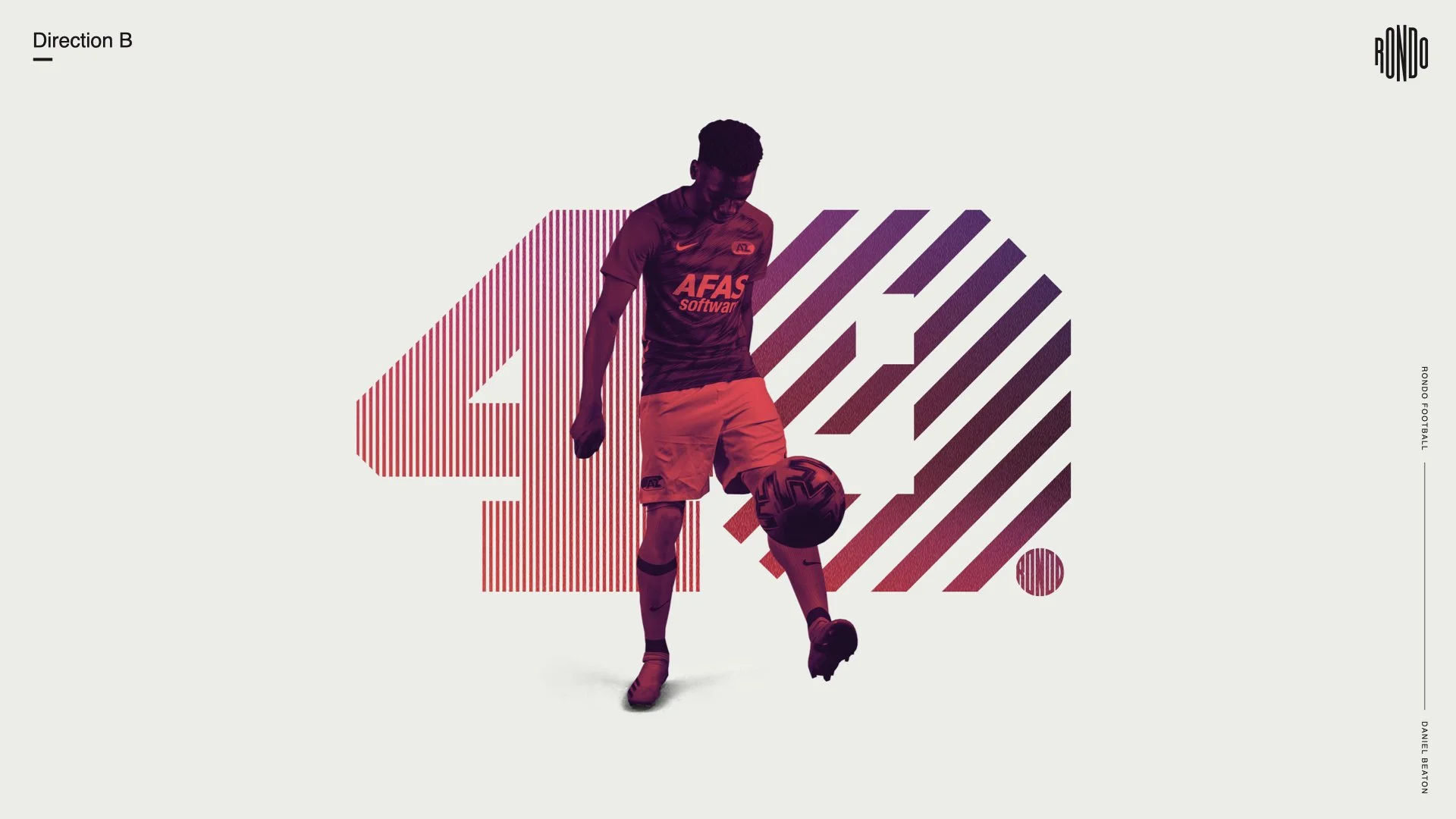
For the logo-inspired direction B we took the framework of the 2nd direction of the last round and brought in those color grad textures mixed with bright highlights and experimental type that feel modern and also logo-inspired and that has a bold, athletic punch.
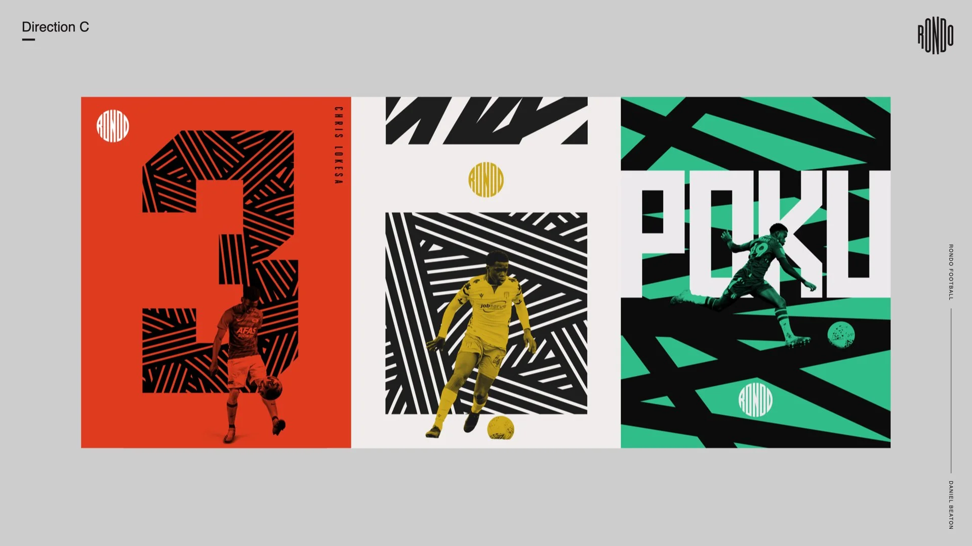
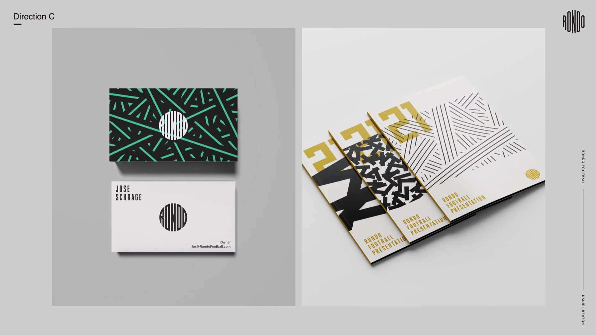
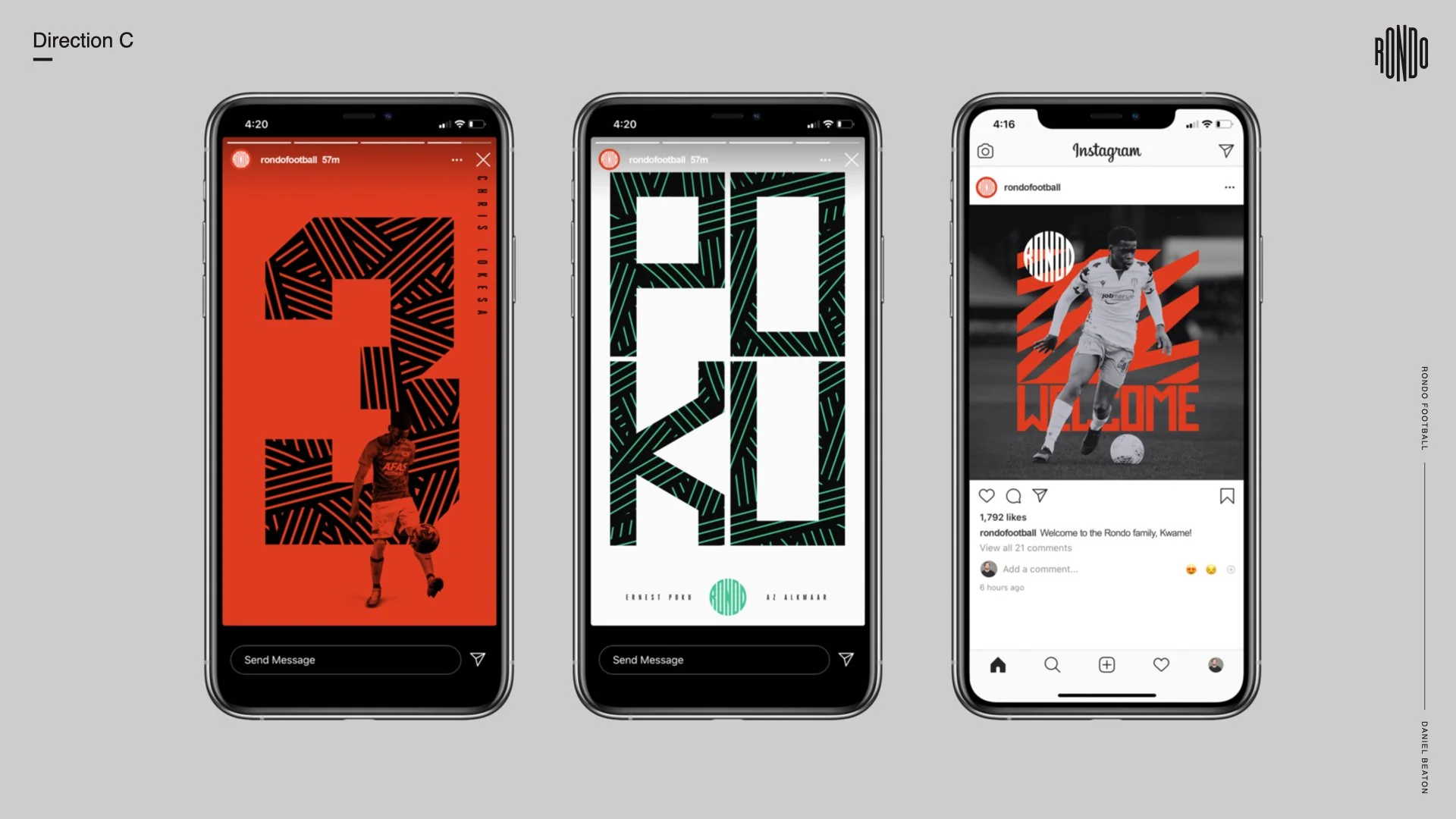
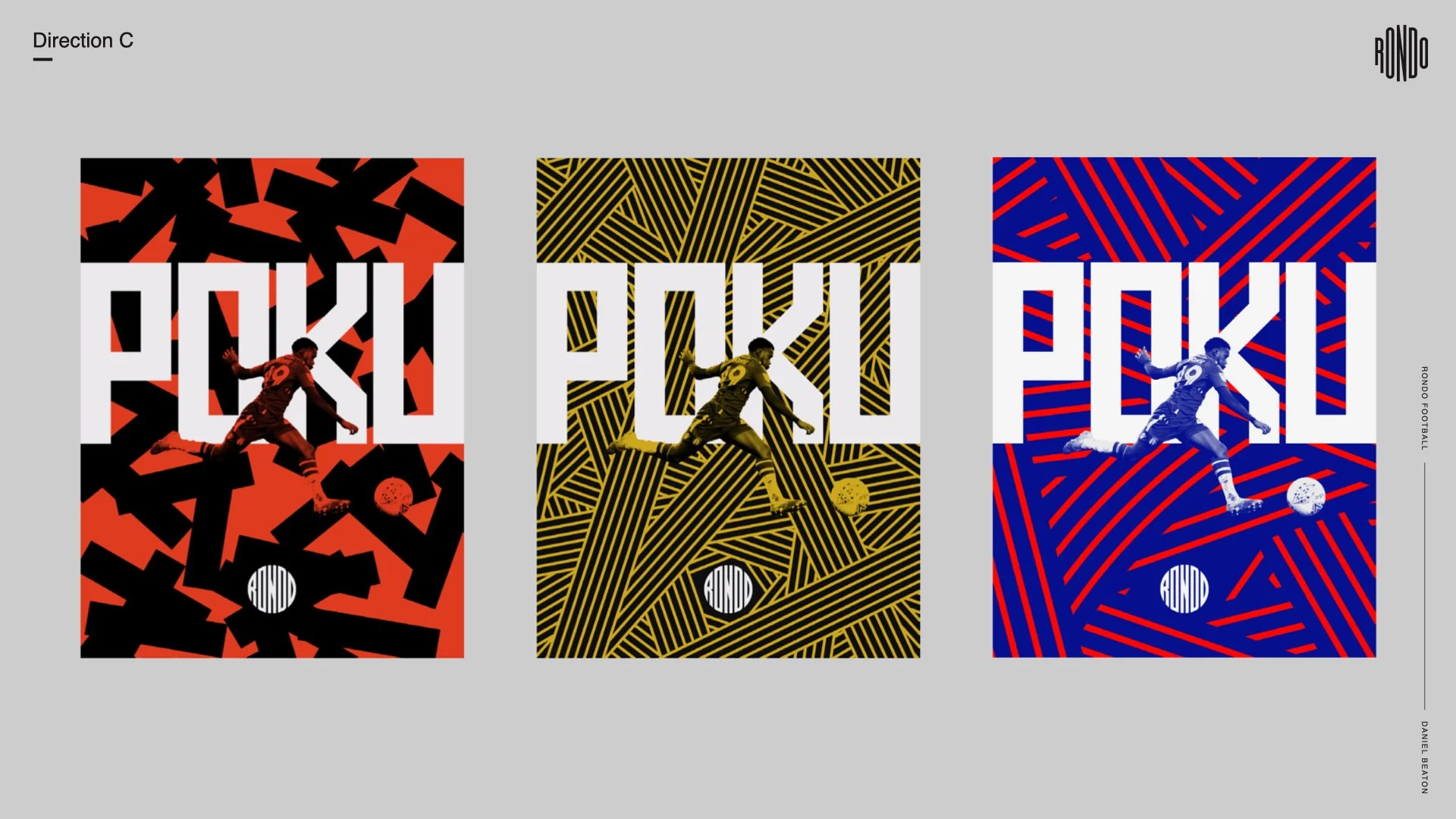
The 3rd direction is a little more of the rebel of the bunch taking the movement of the ball during the rondo drill to a bold, graphic pattern approach while allowing us to dial up or down the intensity.
Logo
Development
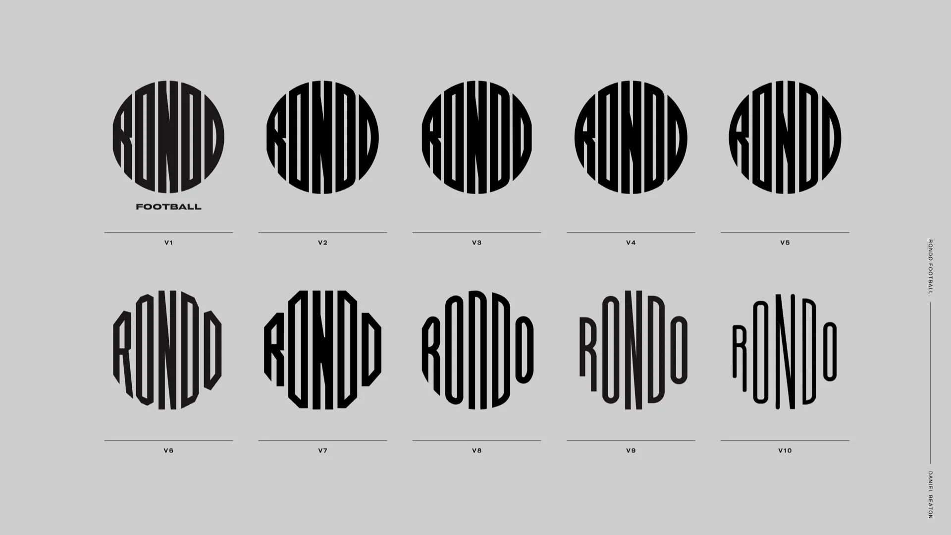
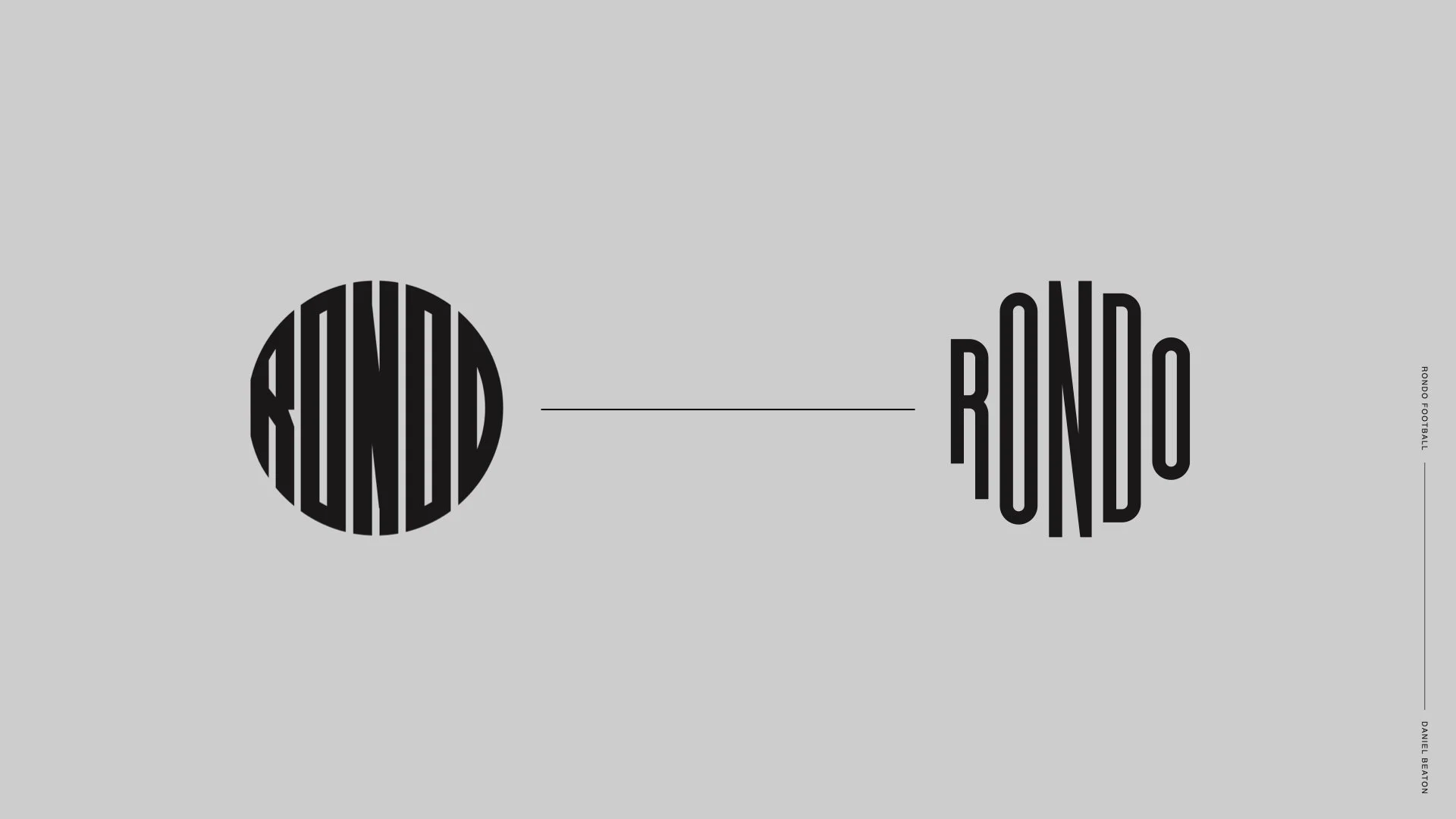
One thing we wanted to take a look at that was outside our scope was the logo mark. Legibility on their existing logo was a major concern so we offered a range of options from most like their existing logo to a cleaner, legible type while retaining the soccer ball shape.