Fortnite Champion Series
Epic Games came to us to completely overhaul their toolkit for all things competitive; branding, broadcast, video and social.
Agency // We Are Royale
Creative Director // Loren Judah
Role // Lead Designer
Previous Package
—
Their old package was too limiting and they felt the system had to be nearly redesigned every few months to keep it feeling fresh.
It also felt too much like the game itself. They wanted Fortnite Competitive to feel similar yet distinct from the game.
The Brief
—
Positive, inclusive, bright, irreverant fun
Their current system lacks strong cohesive elements from broadcast to social
They needed a well-designed system that can be modular and templatized to reflect their many tournament tiers.
Push the boundaries and see where we can go.
16-25 but still have a wide net of appeal
Design a system that allows them to translate the entire broadcast package into 14 languages

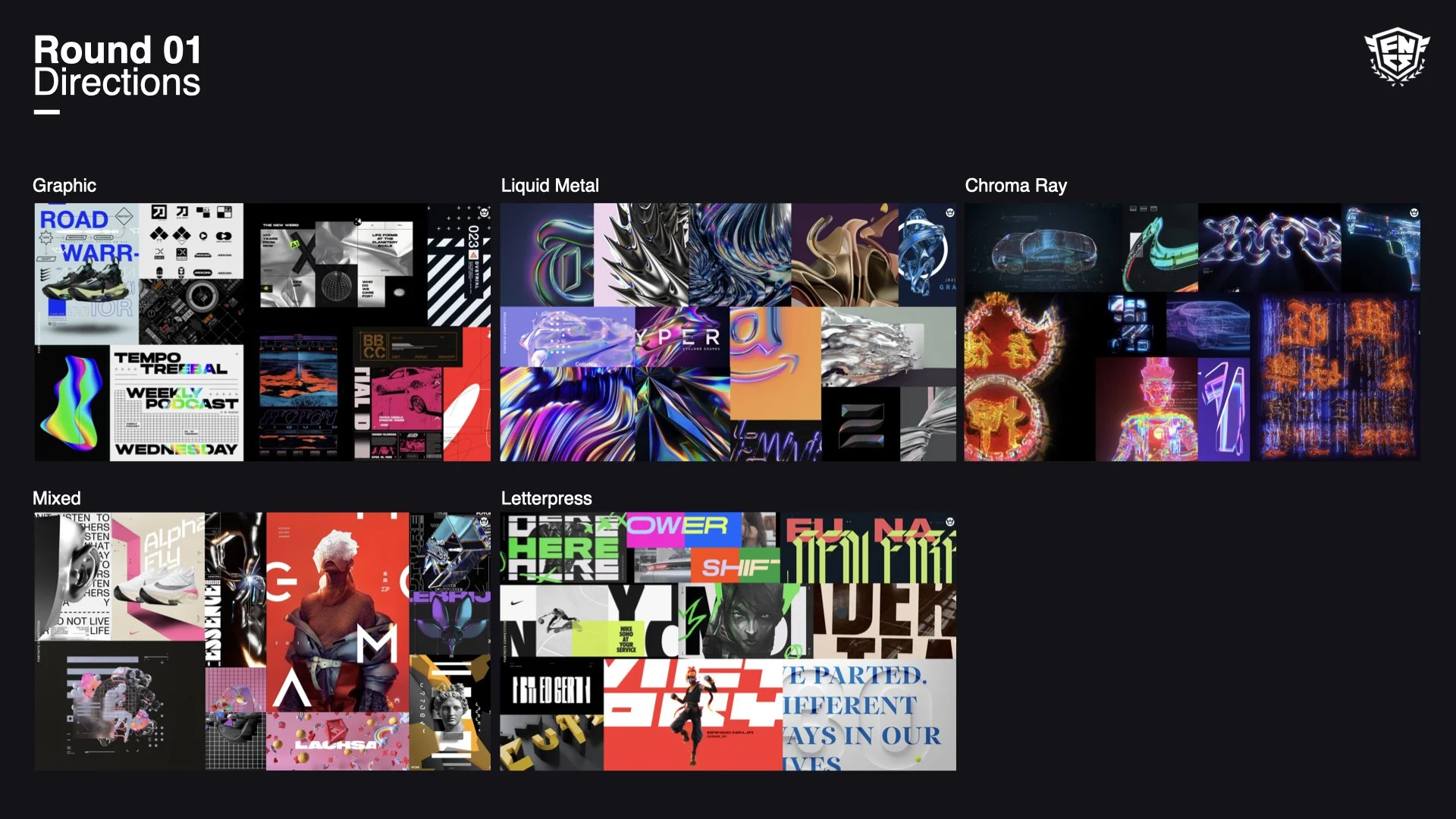
Conceptual Exploration
—
Mix of pulled imagery and some design with the goal of having a handful of directions to develop with accompanying styles.
We want to see which directions (or even individual images) resonate with the Fortnite ethos that captures the right tone and spirit.
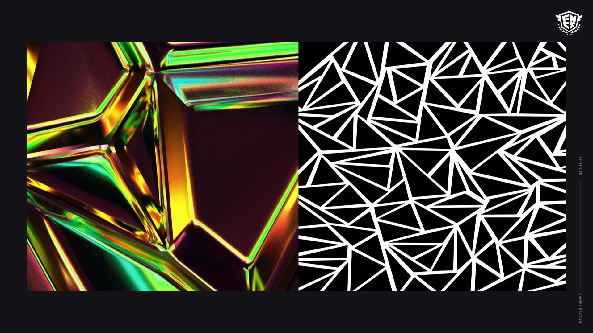
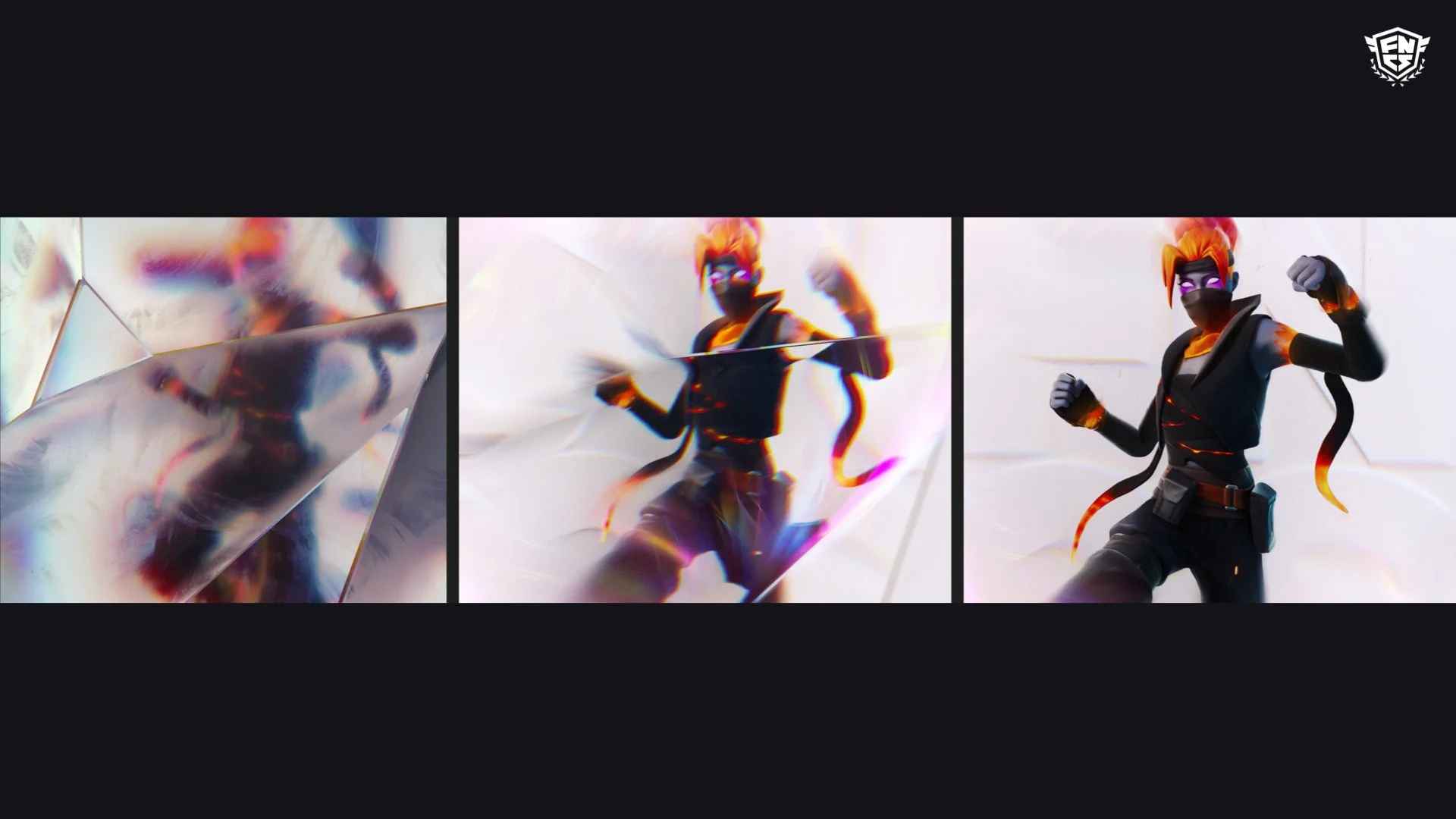
We presented a range of graphic systems, overlapping patterns pulled from the game itself to hyperreal, liquid-metal based environments that makes Fortnite feel larger than life.
Post-presentation the client liked everything except for the chroma-ray direction. Now it’s on us to put it together.
Jump into Design
—
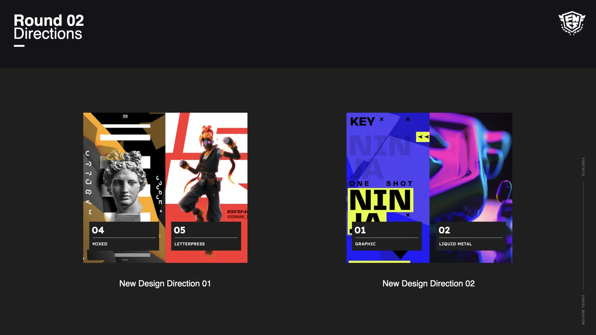
We took the directions from last round and condensed them into two.
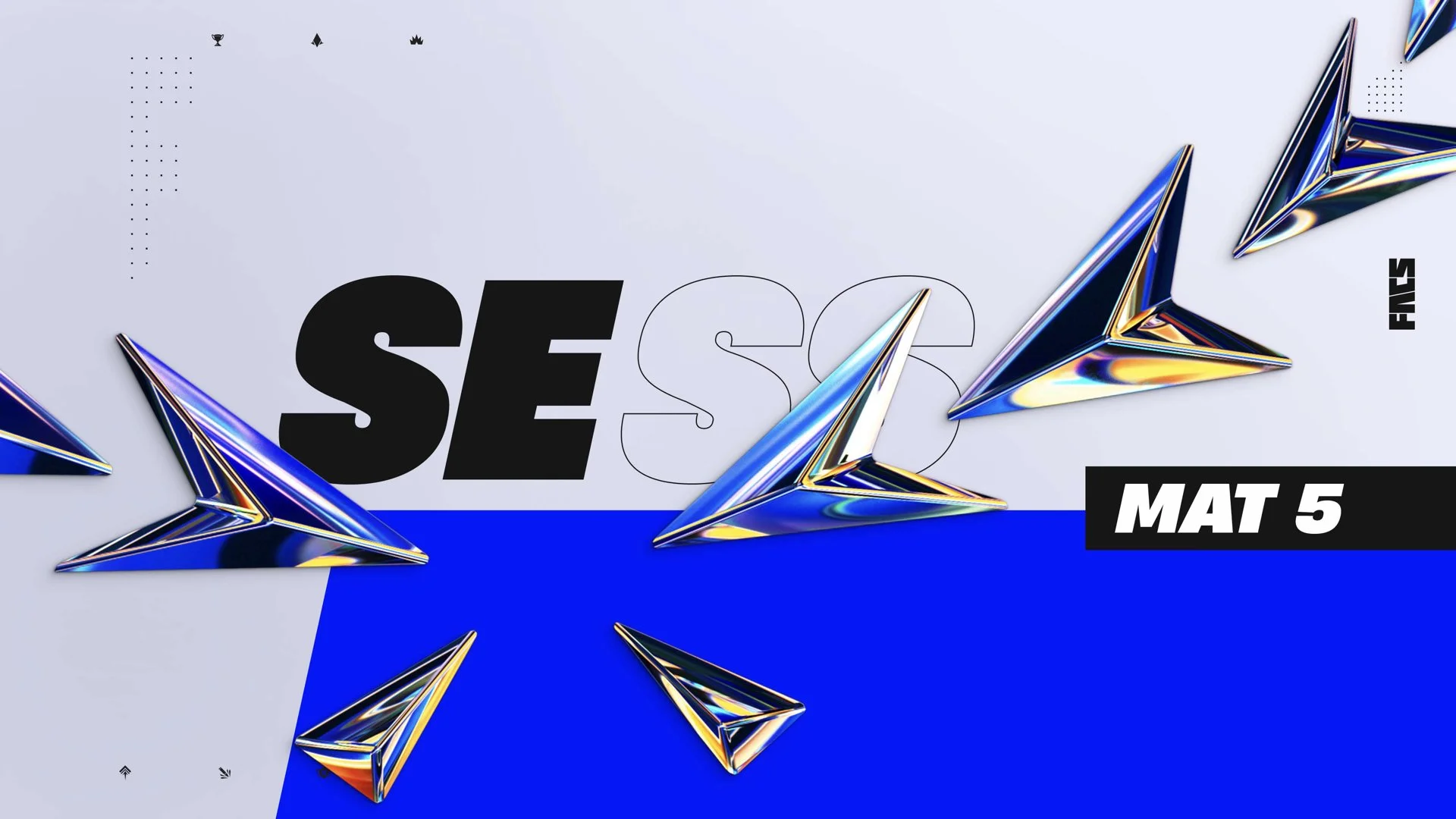
Here’s my design direction that’s a graphic mix of CG elements, dynamic typography and wild motion design that amps the energy up, dynamic compositions and overlapping grid systems.
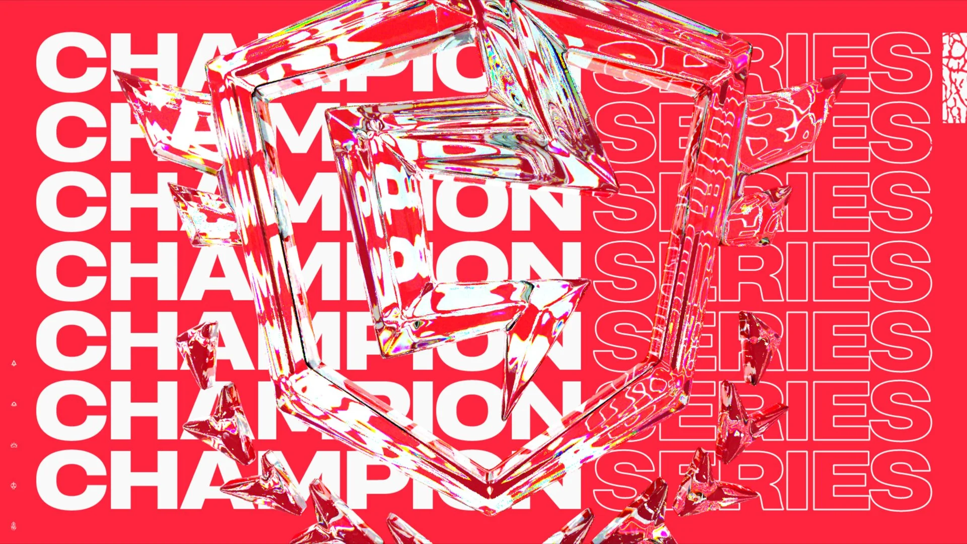
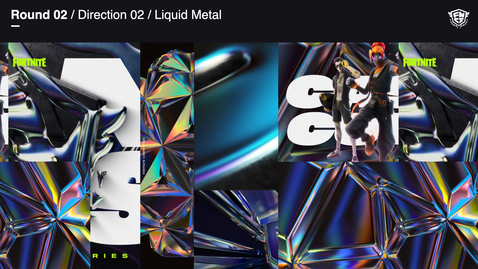
Direction 2 (done by another designer) stands out with its cg chromatic liquid that solidifies into geometric forms, an homage to the fortnite style. The color and reflected tone changes throughout the year for each tournament type.
The client ultimately picked my direction but wanted to include the colorful CG geometric chroma from the 2nd direction.
Putting the Pieces Together
—
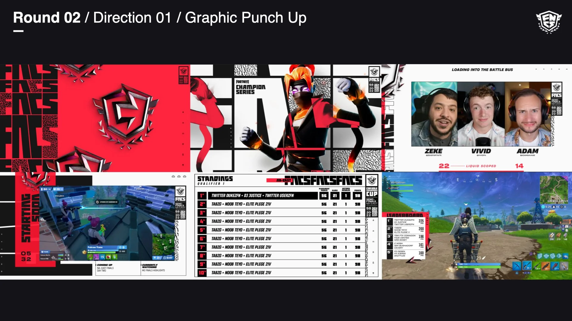
The next couple rounds we wanted to find elements that feel right that’ll help us establish a “north star”, which will guide us into rippling out other primary elements across the toolkit.
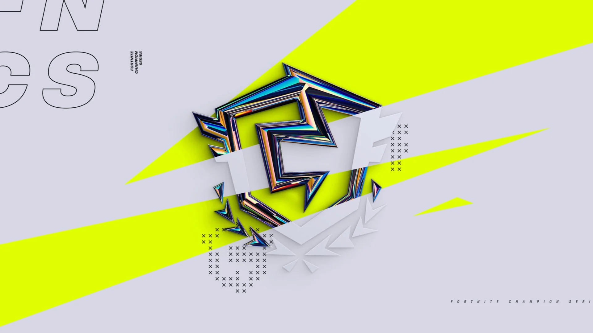
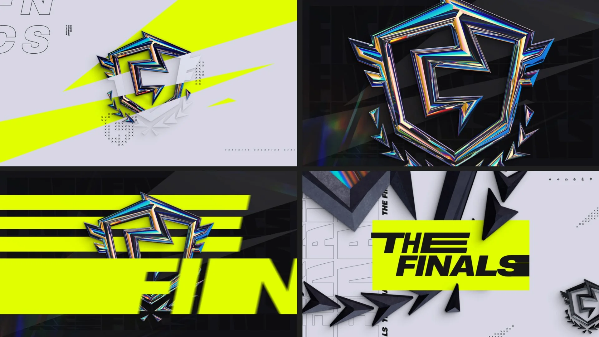
One of the biggest challenges was finding the right balance between looking like Fortnite and FNCS being its own thing. Shards and angled boxes is a prominent design tool from the game and carrying that over to FNCS brought us in that sweet spot.
At this point we’re still exploring and seeing how we can bring type, pattern and color to life with keeping in mind how these systems will work across multiple tournament tiers.
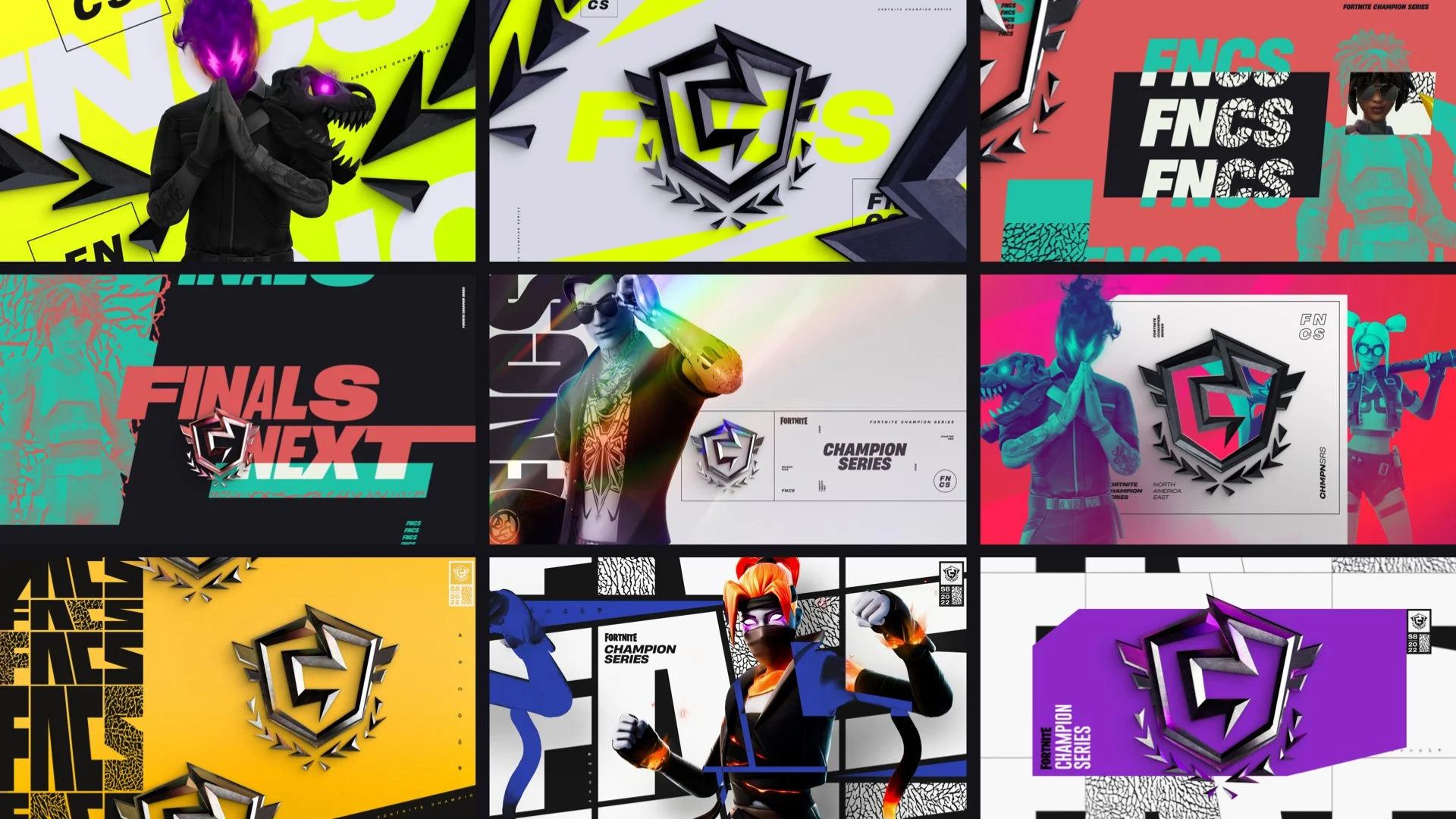
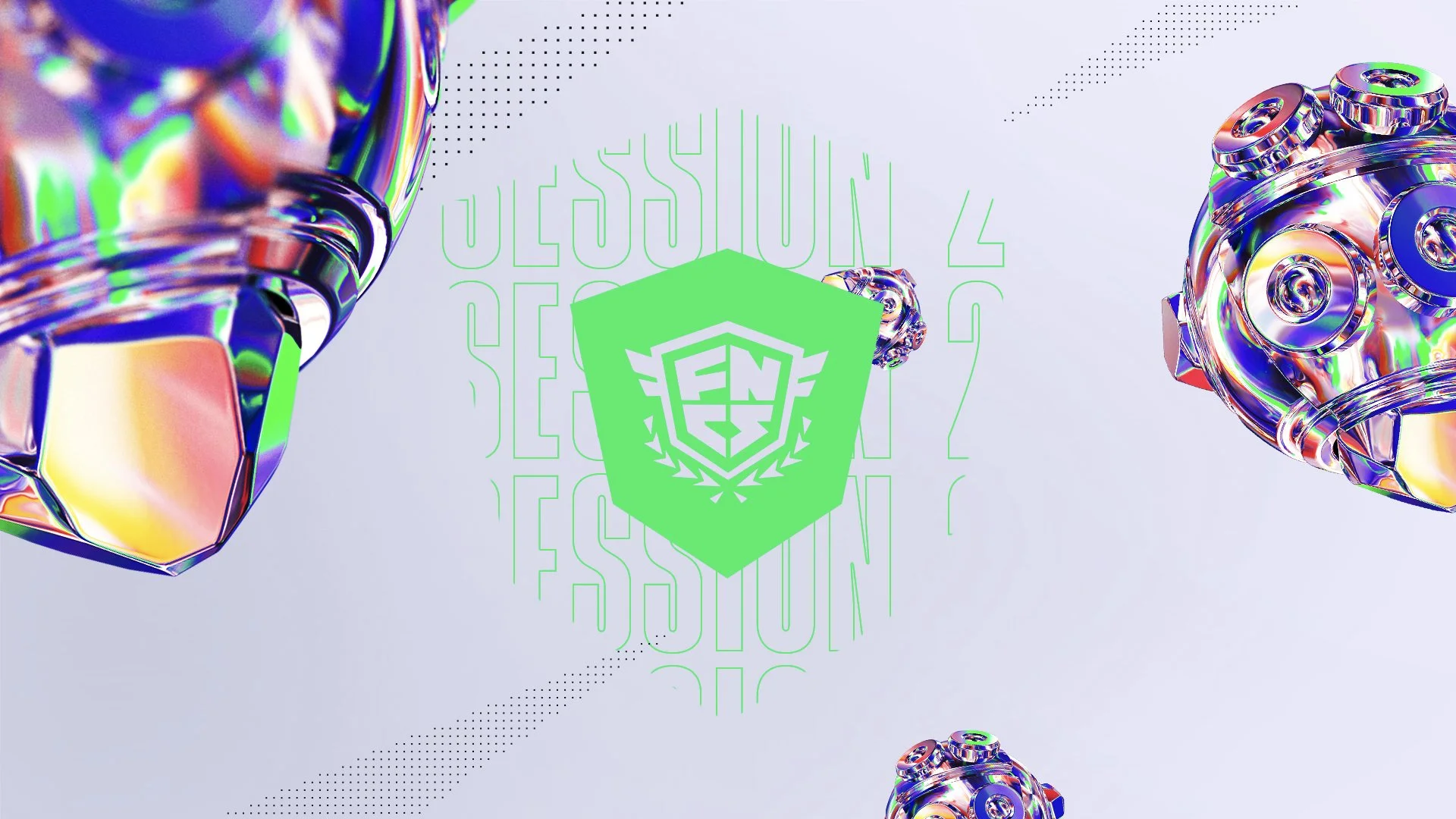
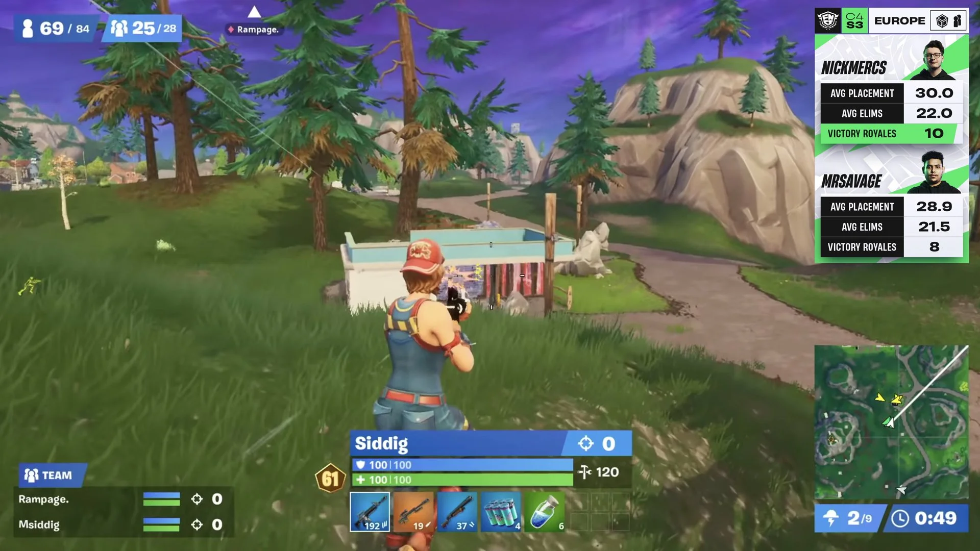
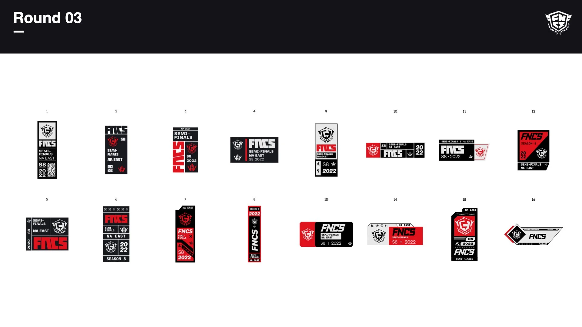
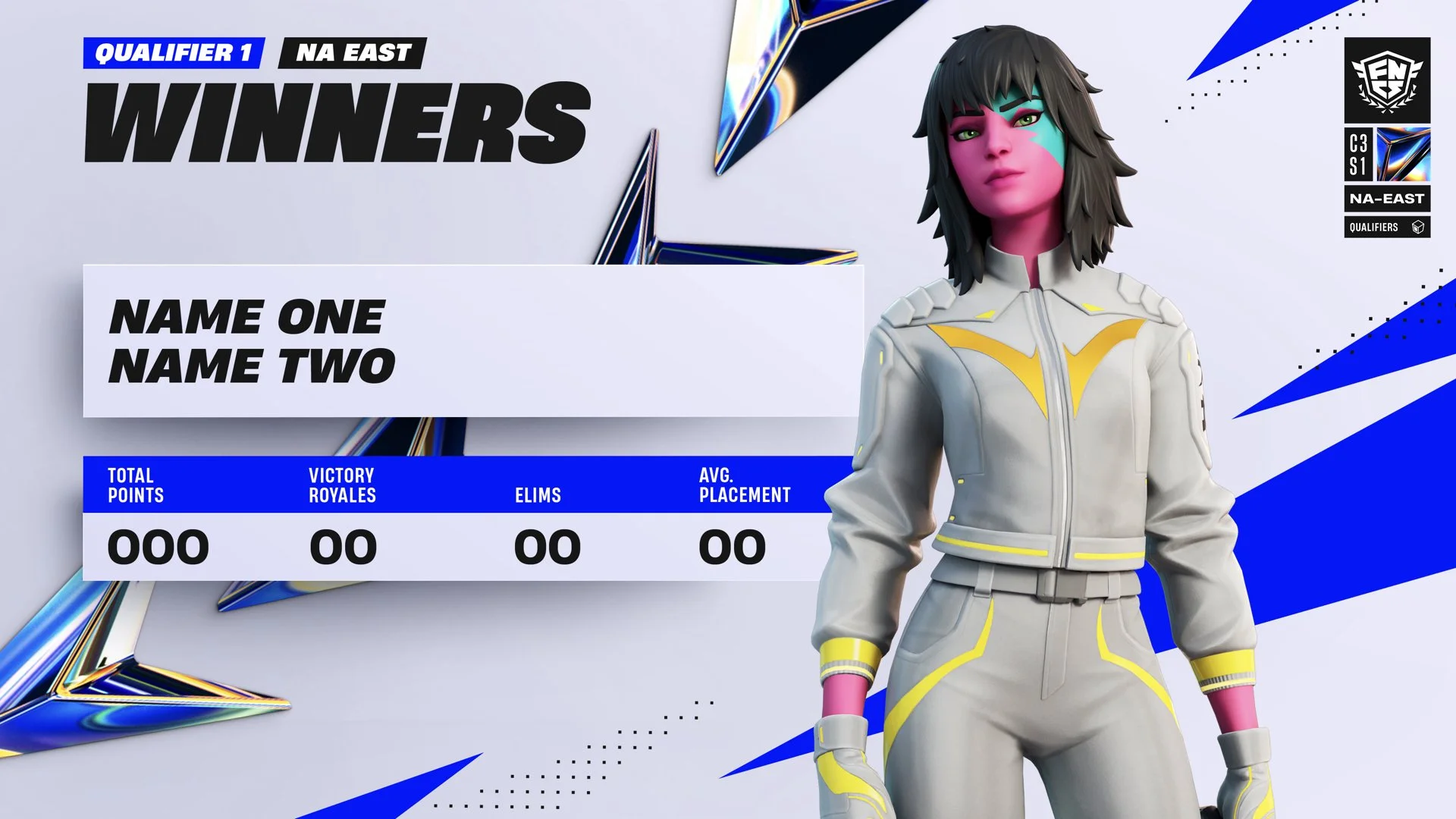
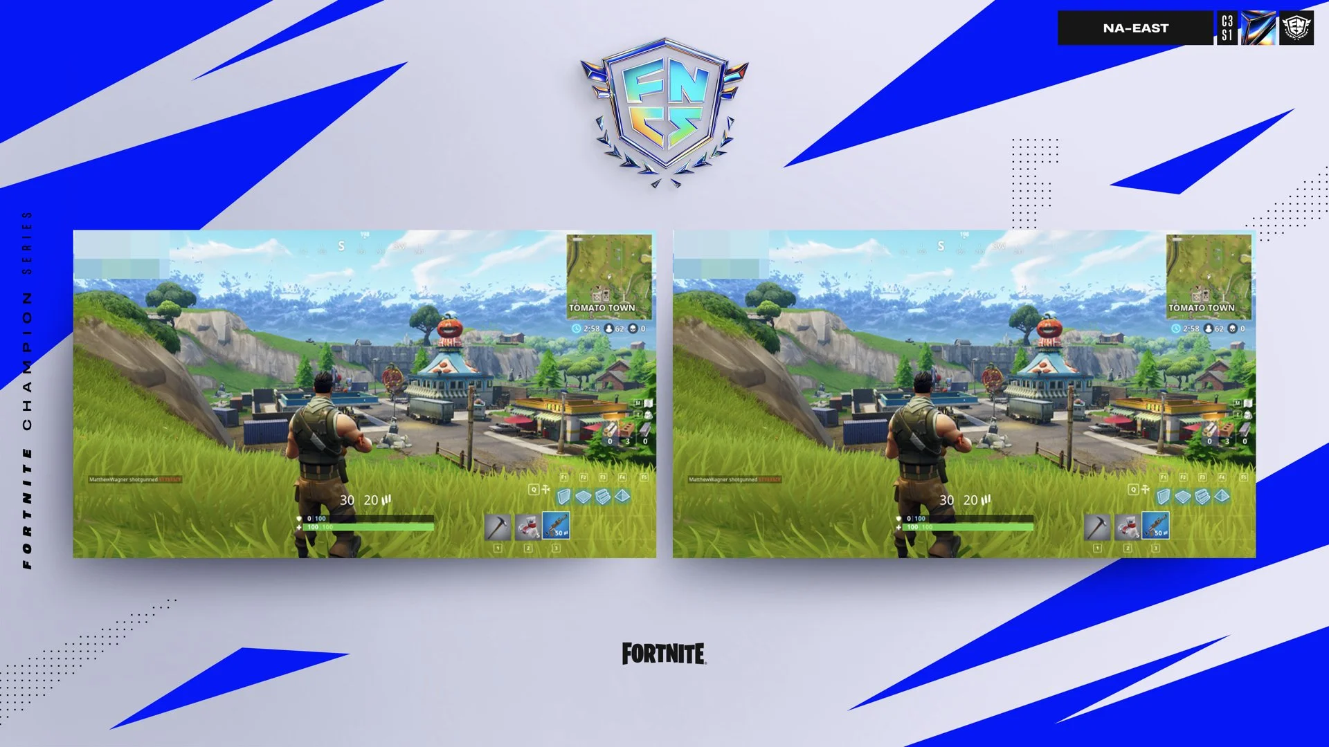
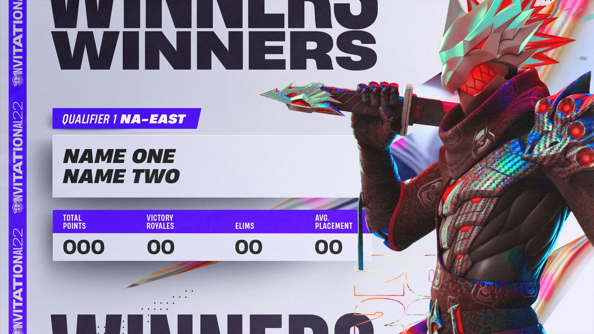
We started exploring a “tag system” that would be present on each resolved frame that would contain lots of tournament information at a glance, like the season #, game type, region, tournament name and so on. This allows this element to do all the heavy lifting and free up the layout from having several titles.
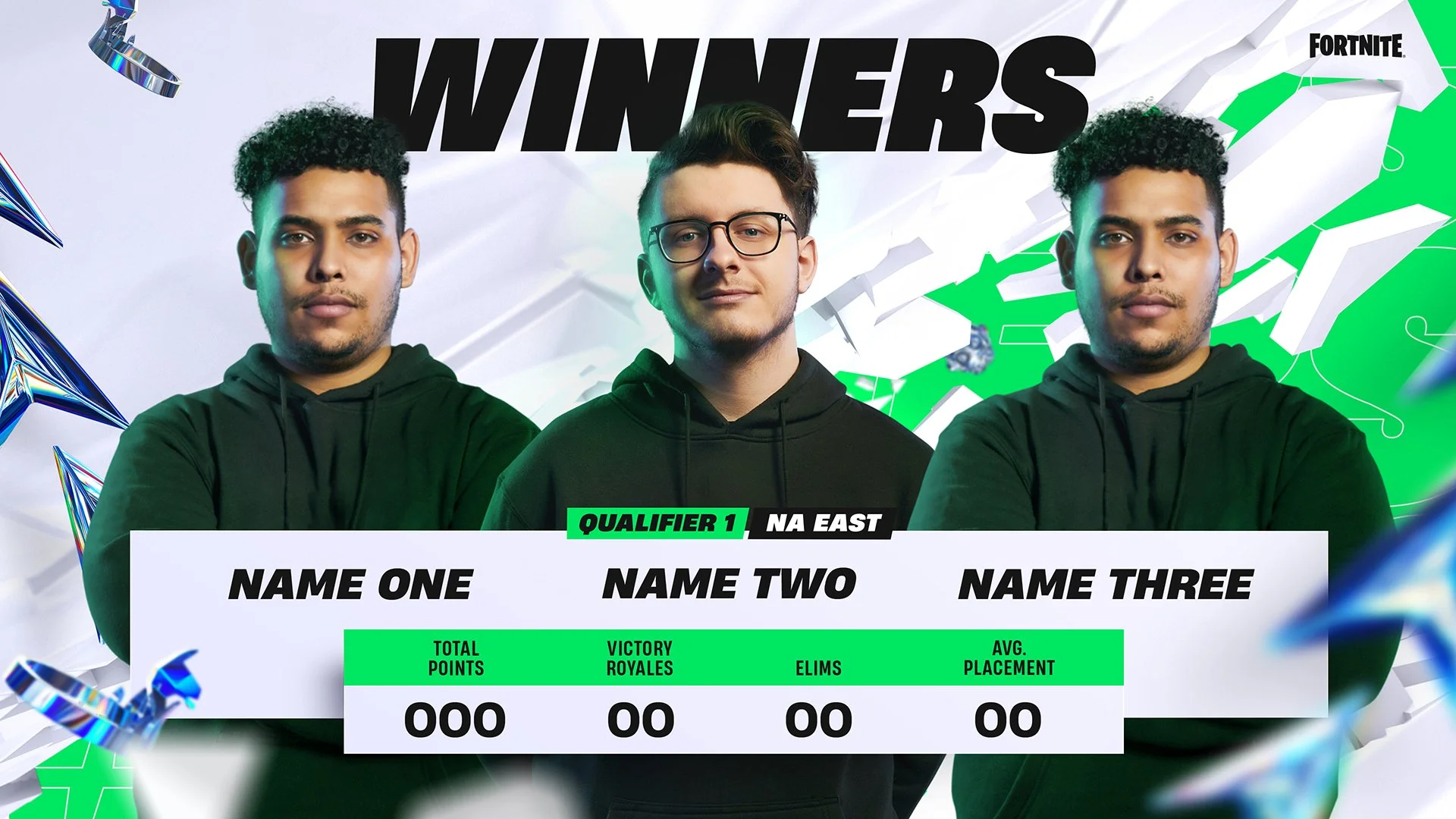
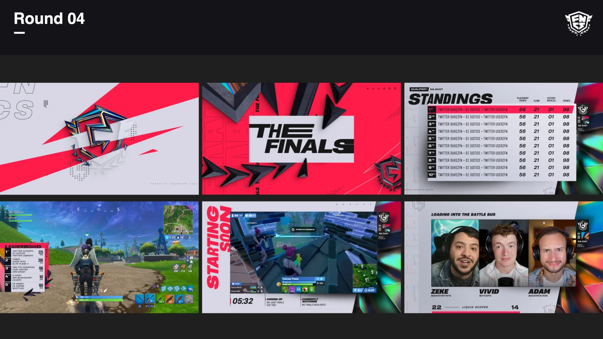
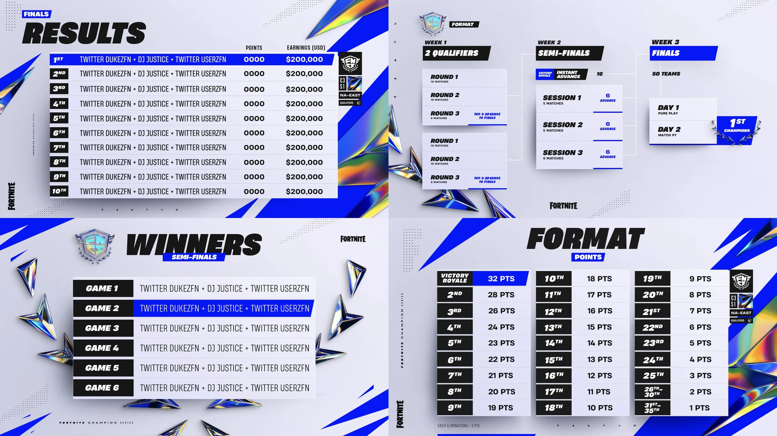
We started to design against lots of real, key deliverables that each hit an important corner of the toolkit, from splashy headline sequences to text-heavy info frames.
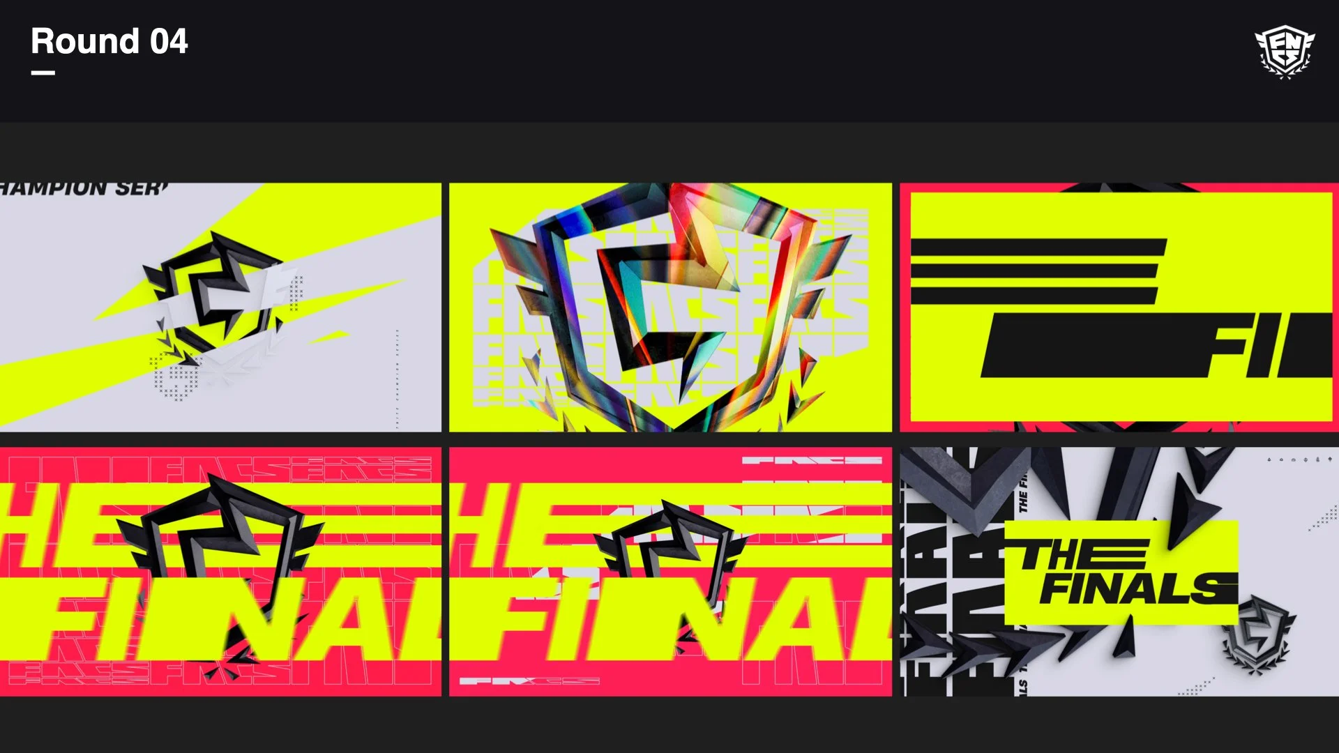
We’re looking at how on these elements can come to life that’s loaded with animation potential.
We started thinking about the look of the other tournament tiers. How the chroma could translate into a pattern perhaps for the general tournament toolkit.
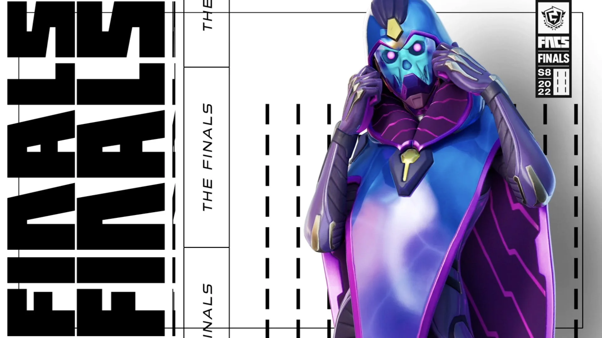
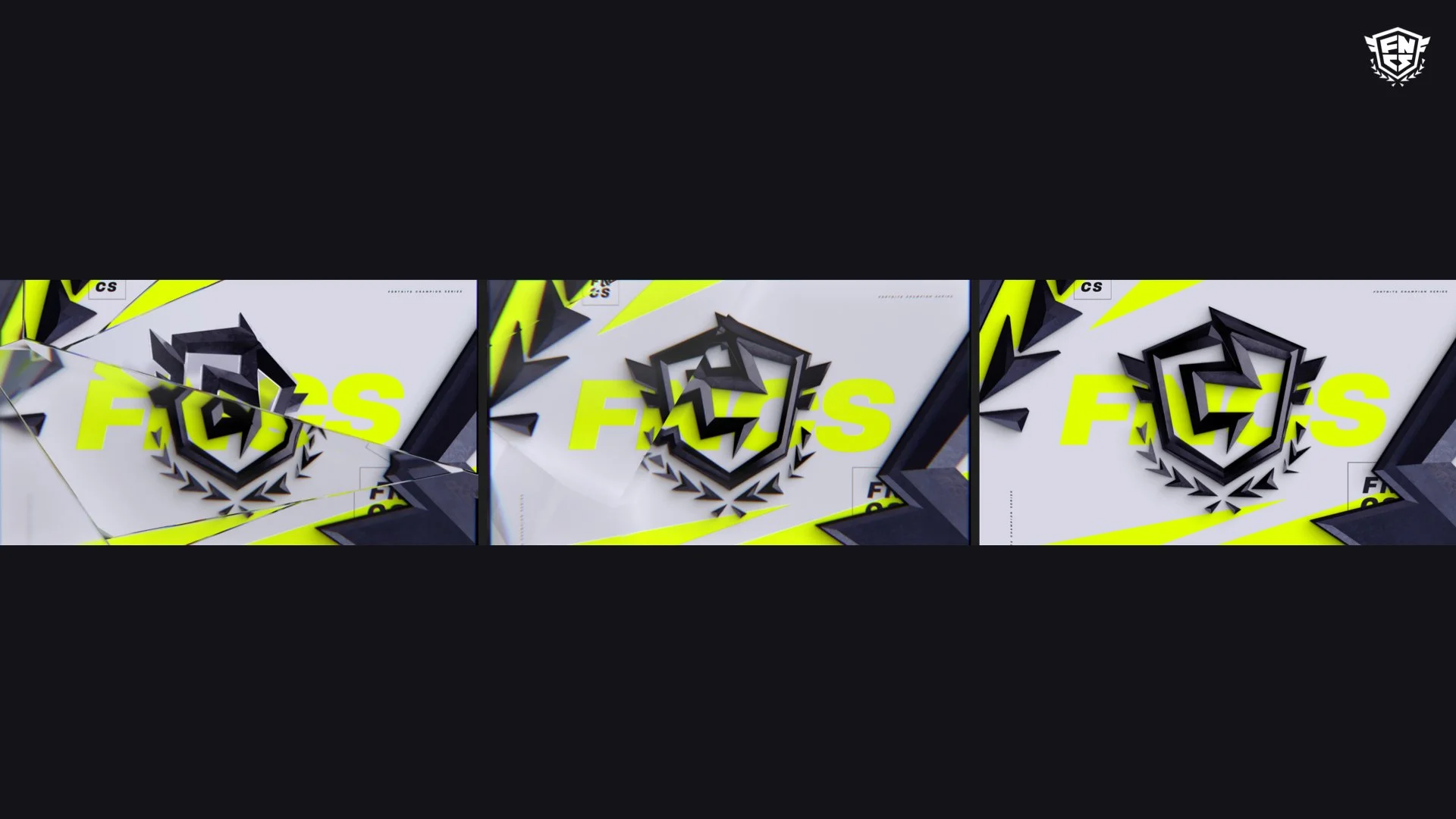
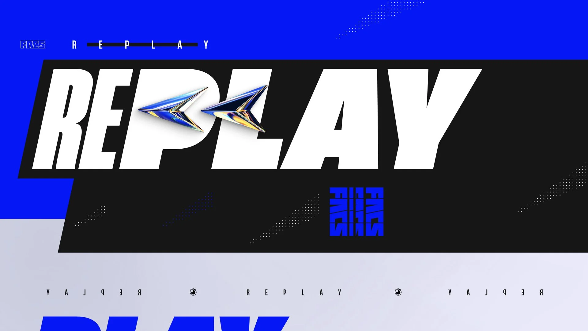
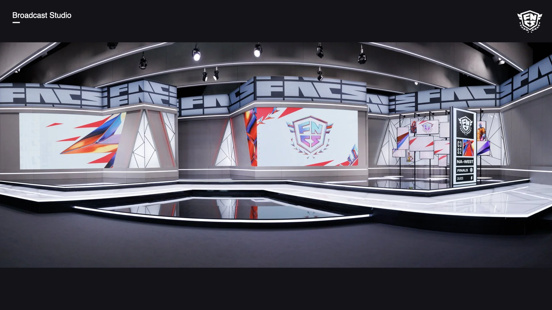
How glass can be used as a device within a single tournament, from qualifying rounds to the finals...
…and looking at how it can animate and resolve.
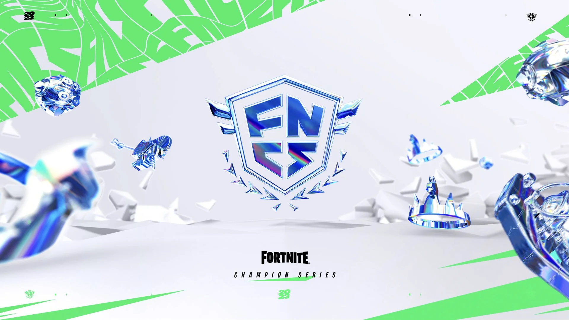
Final
—
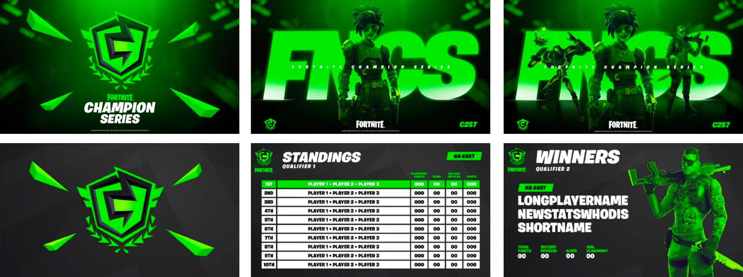
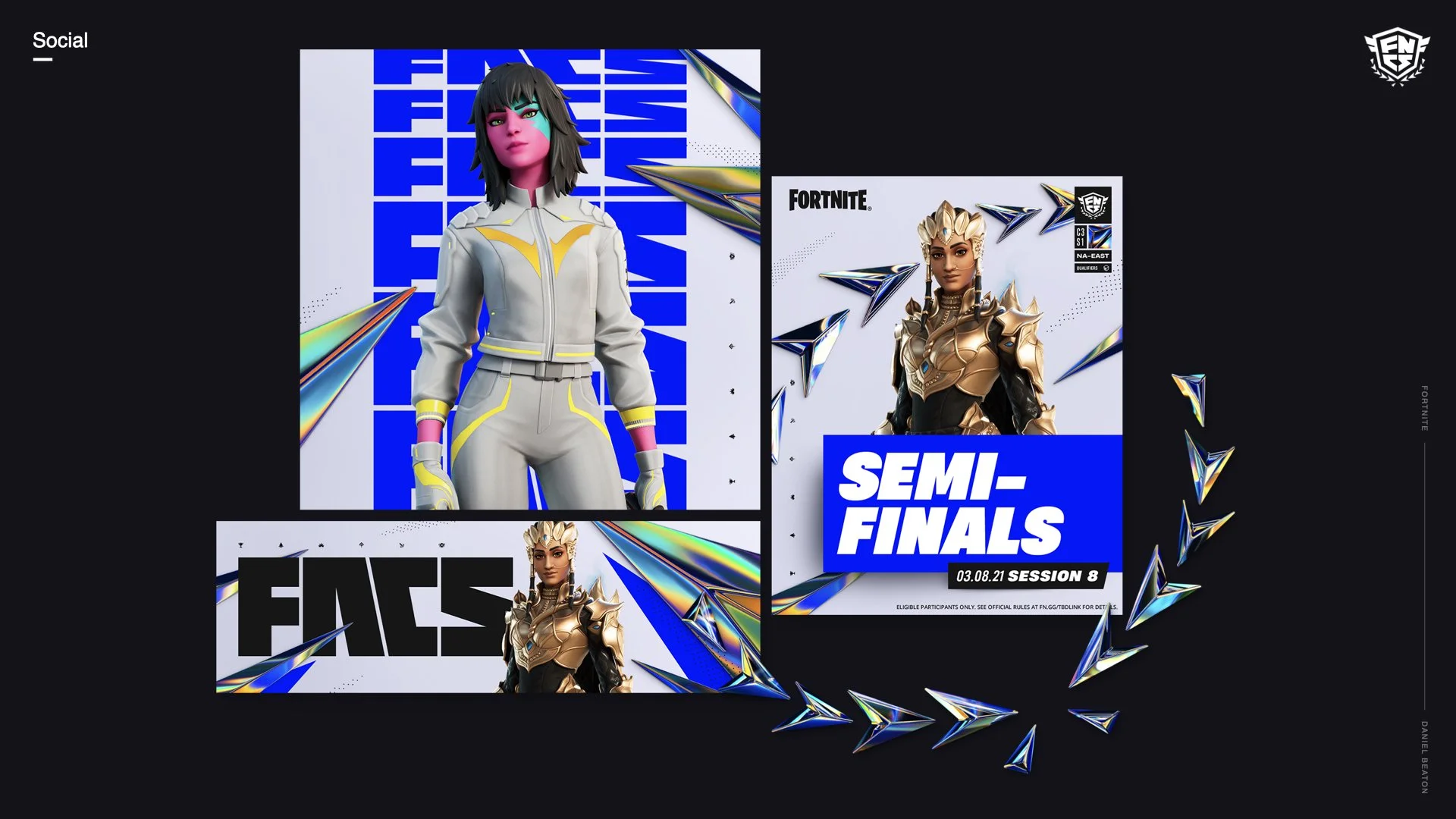
We used the laurels from the logo wrapped in our new colorful chroma to help direct attention.
We added a layer of subtle dot-pattern shards, small game icons and other small filagree.
Style Guide Excerpts

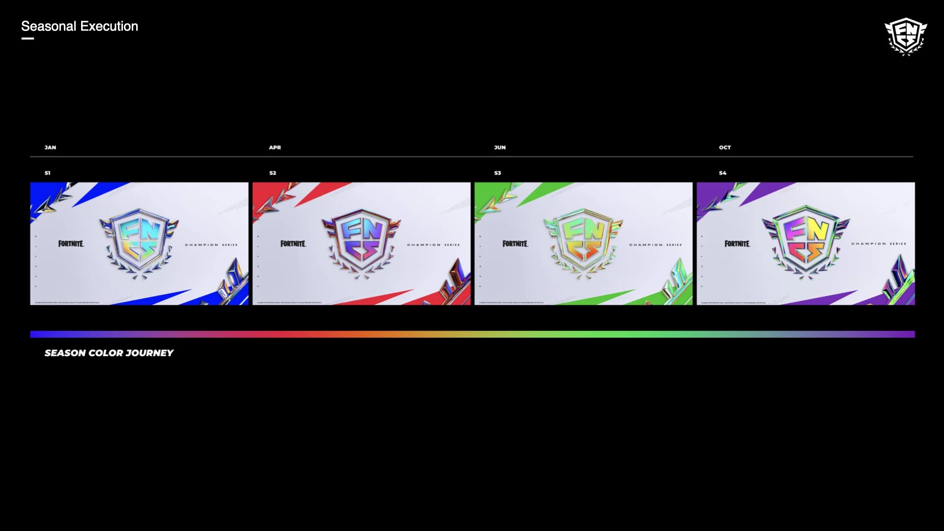
There are 4 seasons per year in the FNCS that each needed to have a slightly different look. We wanted it to feel like a journey using the color spectrum as our guide.
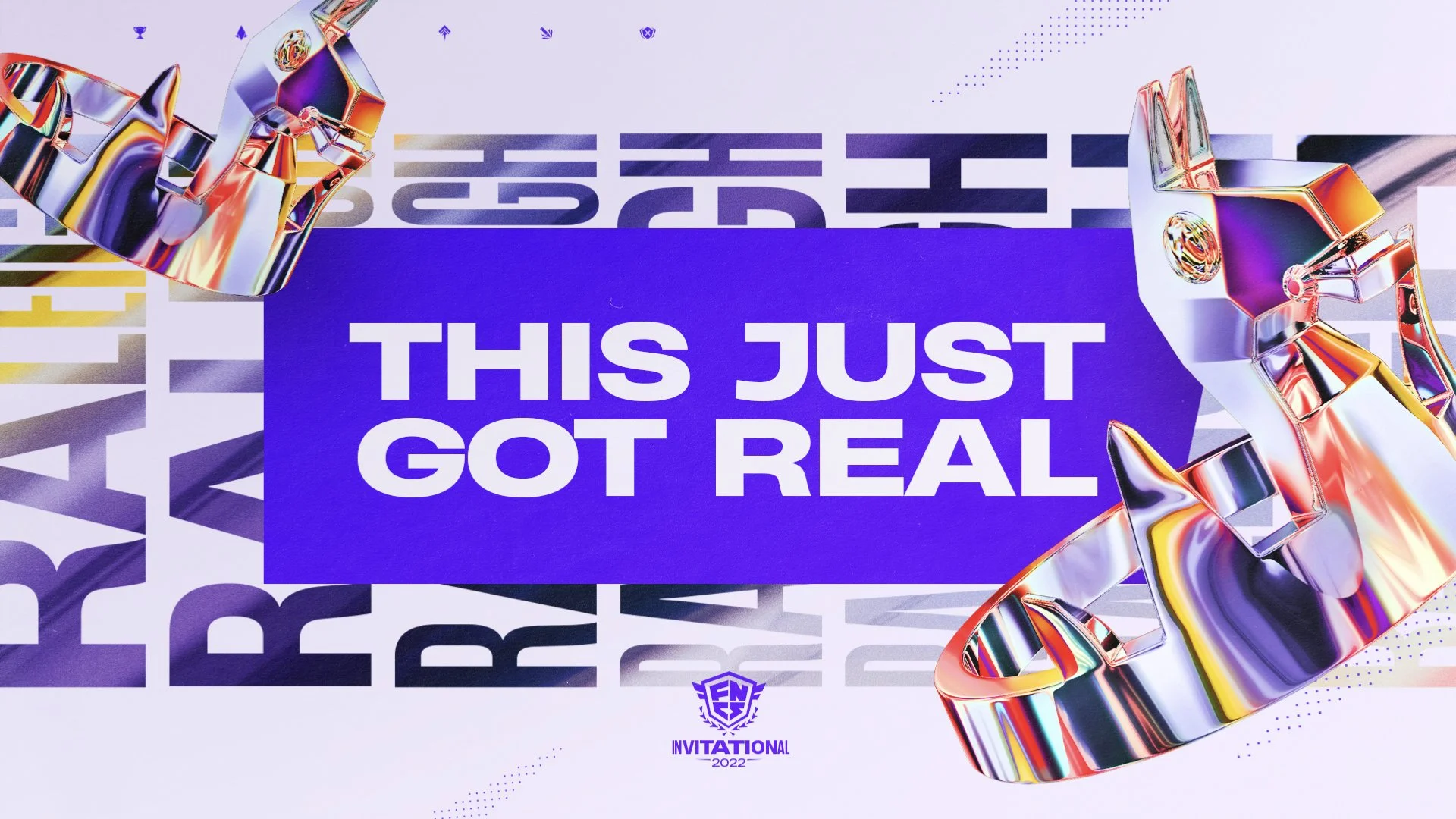
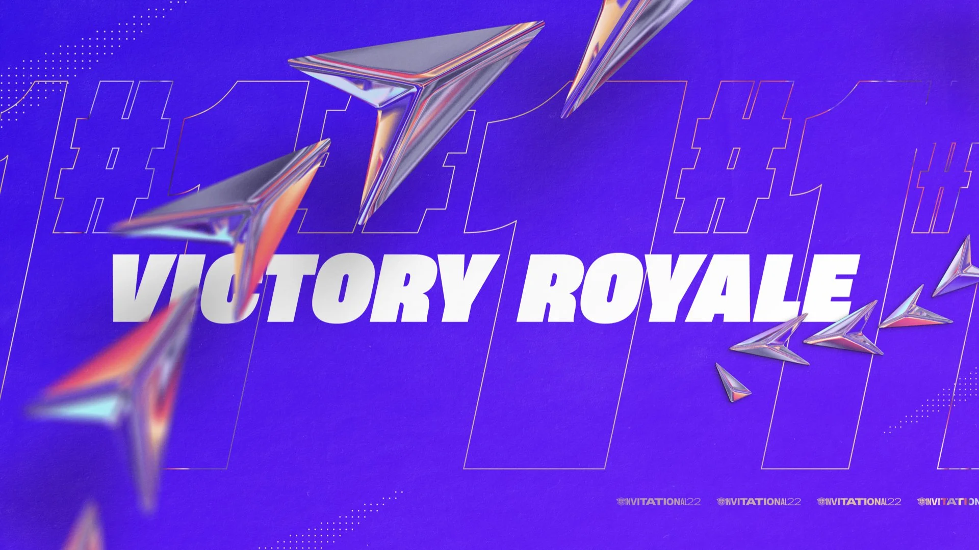
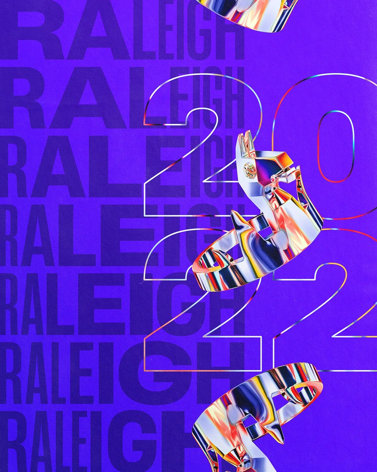
Fortnite Invitational
—
In November 2022 Fortnite had their first in-person tournament since the pandemic. Here’s a look at some of the new design further evolving the new FNCS look. A whole new toolkit needed to be created for this 3 day event.


2023 Evolution
—
Lastly for 2023 we pushed everything further. We Introduced more 3d environments and utilized Epic’s own Unreal Engine to create all 3D objects on the fly which opened up a world of new possibilities. Celebrated the shield shape as a design and layout element and redesigned the tag.